identity showing progression
- Started
- Last post
- 7 Responses
- Miesfan0
Although the idea seems attractive is hard to get a good result.
Because evolution involves displacement in time and space. It is therefore a good solution for an event that lasts a while. But a brand that evolves graphically, what is your relationship to the products?
If the subject was "light" such as this:
The typography evolves from light to shadow ... a fine way to express that brand sells "light"...
- Miesfan0
Here few progress, but work a lot

- looks like MIT press.Josev
- is mill, by North,
http://www.northdesi…Miesfan
- d_rek0
hmmm.. i'm reminded of a fellow colleague's project while I was in college. The idea of a 'dynamic' identity was something pushed on us in one of our senior studio's.
A faux identity for the Detroit Science Center:
http://robotconscience.com/v4/#p…Granted, understanding the identity requires a bit of a learning curve and the ability to experience some things in a temporal context, it still is very attractive. Here you can play with the logo a bit to see how it becomes 'dynamic': http://science.robotconscience.c…
I also did a dynamic identity as a student project, although mine relied on the ability to mix and match a series of abstract shapes to make the identity dynamic. It was not transformative in a figurative/literal sense like what you're talking about though.
- Miesfan0
and this, too

- Miesfan0
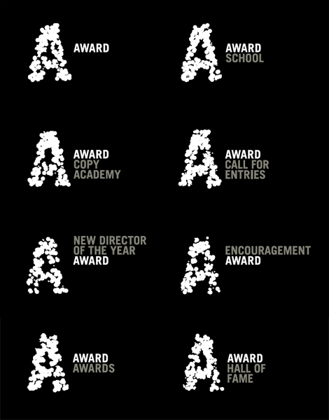
For diferents
- d_rek0
Here is my dynamic identity project from my senior studio. I had to dig thus up out of the archives. Looking back on it I realize that it did not really function all that well as an identity but I was able to create some unique visual patterns and textures using a large library of abstract shapes to keep the identity fresh and dynamic.


