modern world map
- Started
- Last post
- 37 Responses
- lowimpakt0
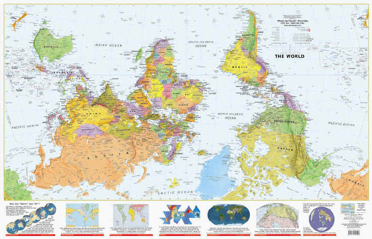
The Peters Projection World Map is one of the most stimulating, and controversial, images of the world. When this map was first introduced by historian and cartographer Dr. Arno Peters at a Press Conference in Germany in 1974 it generated a firestorm of debate. The first English-version of the map was published in 1983, and it continues to have passionate fans as well as staunch detractors.
The earth is round. The challenge of any world map is to represent a round earth on a flat surface. There are literally thousands of map projections. Each has certain strengths and corresponding weaknesses. Choosing among them is an exercise in values clarification: you have to decide what's important to you. That is generally determined by the way you intend to use the map. The Peters Projection is an area acurate map."

- Douglas0
Agree that the compass/sun becomes an odd focal point. It might be the defining factor to someone buying the map. Also, "New Zealand" crossing over southern Australia and not touching New Zealand seems a bit odd.
- Ruffian0
No, thank you.
- sureshot0
wtf! gemany is overlaying belgium and the netherlands.
- ********0
Sorry, but that's just a worthless map. All style and no substance.
Whats the point of only listing the most popular countries? Everybody already knows all of them and where they are. I don't know about you, but whenever I look at a world map, I like looking at all of the smaller, lesser-known countries - just for the sake of my education and wanting to know where they are.
- ********0
They registered just to post this .. I think we've been had - it's spam.
- ********0
^ ironically, spam backwards is maps.
- Haha! brilliant :)********
- That just blew my mind.DoTheMacarena
- Haha! brilliant :)
- ********0
it's aesthetically pleasing, but lacks a great deal of information.
it needs to be revised if you want to charge $60
- i_monk0
- i agree with this. always have. who's to say that's not right-side-up? its a rock floating through space FFS.********
- i agree with this. always have. who's to say that's not right-side-up? its a rock floating through space FFS.
- voiceof0
You approached this all wrong. You should have just said "we made this nice simple poster of a basic map of the world that will look nice in your office" you wouldn't have to deal with half of what's being said.
- gramme0
Nice, but I agree with others. That's one huge compass rose.
- Projectile0
haha for fuck sakes!! I literally just spent the last half an hour talking to my housemate about doing exactly this!! Well ok I have something very different looking in mind.
but fuck I hate it when you have an idea and someone else has done it
heyyyyy.. did you sneak into my room and listen to me sleeptalking?
- shrug - do it anyway********
- make one thats better.********
- Do it anyway. a map is not an idea, it is a concept. Do it and I'll buy it.SoulFly
- shrug - do it anyway
- SoulFly0
I spent all day thinking about this broadcast.
I'm so intrigued by this map.
I have the .jpg screencapture as my desktop picture... wonder if I can download a map vector and replicate the hard edges effect with the "simplify map" but then I will choose which selected countries to include the names.
- arthur0
I agree that it needs ALL country names on it, so many are missing. It's a very attractive map, but I'd like it to be more informative. Add country capitals too, real tiny.
- ********0
It's a nice looking map. and yeah, the straight lines are nice, i didnt notice that earlier. just needs more country names, and make sure the names are placed well.
- MrT0
I'm not feeling the magic, sorry. Lovely colours and nice at a glance but I don't think that should come before the function of a map, particularly of the world. The lack of detail makes it feel like an early-learning aid, yet the jester's face would probably give children nightmares.
http://www.futuremaps.co.uk are better for me.
