Font I.D
Font I.D
- Started
- Last post
- 3 Responses
- Ambushstudio
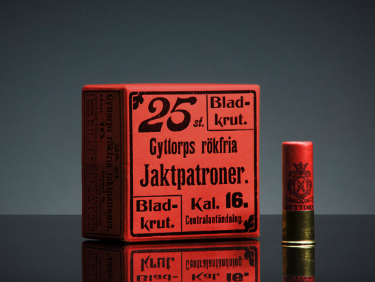
I reckon there´s a cool mix of fonts there, the one I really dig is the one used on the ¨Jaktpatroner¨ word.
Thanks much
- jaylarson0
It looks like someone squished Cochin
- Josev0
looks more like a stretched version of Runic Condensed.
- Amicus0
@Josev. Yep - Very similar. I wouldn't mind betting they started with this, shortening the stems wherever they could and then slightly reworking the J and k.