bus card opinions
- Started
- Last post
- 22 Responses
- ********

i have to use the dolphin football colors only.. for a local cleaning service..
they have no logo yet..
what else come to mind when you think top notch?
- ********0
using a football team colours is pretty much all that comes to mind when designing a business card for a cleaning company. You added a mop which was a touch of genius, I think you're done.
This is a great business tool, they will be so proud.
- lol********
- And if you make it too legible, people will think it's boring and then throw away the card.********
- lol
- Amicus0
Create the logo independently of any business card, letterhead or other use.
Create it in B&W, make sure it is readable used very small.
- iCanHazQBN0
dad shoulda pulled out.
- as with you_salisae_
- sup girl.iCanHazQBN
- rude but gotta lawl.VectorMasked
- _niko0
bottom one's not bad. It's a cleaning service FFS. You want someone to clean your toilet not be clever.
- So true. This isn't fuckin' art.********
- thank you********
- So true. This isn't fuckin' art.
- gramme0
x
- akrokdesign0
o
- ********0
The 2nd and 3rd business cards are more than adequate. Either of them would do nicely.
I wouldn't put too much stock into what airey said, his work isn't that great either. I don't see a single logo from his folio that is worth a damn

Many of you need to fuck off back to Ffffound if you can't handle design for the real world.
- < Definition "awful type"********
- airey's work, that is.********
- thank you for saying it for me_salisae_
- Hahaha.********
- Also, I was lol'ing at the last sentence. I think some of airey's logos are solid.********
- to be fair, his work is more than a notch above pockets stuff above.Amicus
- some of them, yes. but he's in no position to say anything about someone's type being awful._salisae_
- so where's your folio nostradamus?airey
- this is awful type, imo
http://www.grabup.co…_salisae_ - far away from the eyes of nasty, bitter people like myself, airey.********
- i like it.airey
- Lol Amicus. Nice pun.********
- nice work airey, i like most of those logos.Milan
- thx milan but you're in a minority apparently.airey
- i like your packaging work quite a lot_salisae_
- did you outsource it?_salisae_
- Are you really going to get all bent out of shape over ONE person's comment? Seriously man, get over it. Your work is fine.********
- no. the work's 100% me.airey
- I'll be back in 30 seconds to read your follow-up comment.********
- also, i didn't realise i was bent out of shape? what shape am i usually? what have i bent to?airey
- that was a joke_salisae_
- what was?airey
- Well considering you're talking about this in several threads, yah, I'd say you're taking it to heart too much.********
- whether you outsourced your packaging work or not_salisae_
- "did you outsource it" was a joke.********
- this kind of banter really makes me hate design_salisae_
- fair enough.airey
- To be clear, I wasn't debating airey's talent. I think his work is quite nice.********
- < Definition "awful type"
- akrokdesign0
- put it "centered".akrokdesign
- font seems too fussy imo_salisae_
- you would know about fussy.iCanHazQBN
- you're so cute, icanhaz._salisae_
- yes, it's a bit female. i mean, fuzzy. lol.akrokdesign
- ********0
I would stray away from the first iteration. It's too sterile (not in the way you will want to achieve) for a low-level brand like this. You are definitely going to want to err on the side of eye-catching and memorable.
That being said, I would stay away from the check-mark and dotted line visual devices you have explored already. I think that if you used an elegant typeface to imply the top-notch differentiator, you will find that the rest should fall into place where appropriate. The use of the screened mop is a nice touch, but I might suggest using a more refined illustration of the mop.
I think what you have shown is a decent start for sure, and I wouldn't feel locked-in by the pre-determined colors–they aren't black, and at least it isn't red, white and blue.
Also, as Amicus said, stick to black and white initially, and then explore color implementations in the final stages.
- ********0
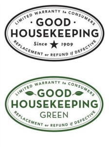
Nice suggestion, akrok. Could be an interesting match. He's got a sort of "Good Housekeeping" retro feel, and that might fit nicely with some work.
- Yah, I'm definitely getting that clean vintage feel from that script. I'm adding it to my wish list now...********
- Yah, I'm definitely getting that clean vintage feel from that script. I'm adding it to my wish list now...
- ********0
dMullins, I disagree with it feeling "too sterile". I'd say they're pretty populist in terms of design. It instantly reminded me of these recently redesigned logos:
- Very interesting. I did not get that feeling at all from the first one.********
- Very interesting. I did not get that feeling at all from the first one.
- ********0
But yeah, do agree on needing a more refined mop, it's cluttering up the background.
- _niko0
Don't go nuts though, unless this is a company that's expanding nationally and throwing tons of money into branding, I'd say you're pretty close.
- agreed. Don't "start from scratch" like these weirdos suggest.********
- agreed. Don't "start from scratch" like these weirdos suggest.
- ********0
Another thing. Those aren't the right colors are they? The Dolphins are teal and orange, right?
- gramme0
What Amicus said is right on. I don't think any of these are working for you, and color as someone else said is not your setback here. As far as typography, I think 50s ultra clean, almost Chevrolet-like script faces would be appropriate, rather than Bickham which feels more like a catering company. So at least the script thing could be salvaged. Veer will have some affordable but well-drawn options that would suit this project.
- Milan0
I don't like any of them, but it's for a cleaning company and you're probably doing this for free, so who gives a shit... I'd at least try to make them legible if you don't wanna put too much effort into it.
- _salisae_0
pockets, next time don't ask for opinions. ask for a proper critique with defined reasoning.
- OSFA0
Still waiting to see version3's version...
