design a typeface 2009
- Started
- Last post
- 629 Responses
- TomBac0
number 9, version 1
- TomBac0
Number 9, version 1

- awesome facei_monk
- bravoMau
- clever :)WeLoveNoise
- thats sweet!FallowDeer
- Cheers lads. :)TomBac
- i_monk0

- love it. actually its magnificent.TomBac
- NICE NICEMau
- I can dig it, very Ontario Daily Keno Jackpotesque!
* strokes chin and ballsneue75_bold - I was aiming for "The Price Is Right". Post example of Keno $?i_monk
- I'm just an old man, having a slice of fun pie, I have no idea what I'm sayin..neue75_bold
- dyspl0
where can I get the template? link in previous page doesn't seems to work.
- i_monk0
I'm going to make a ¢ too.
- WeLoveNoise0
anyone doing the fullstop cos i was thinking

- Drama!i_monk
- you need to sort out the kerning on that mate lolFallowDeer
- WTF its kerned !!!!!!!WeLoveNoise
- It needs a serif.i_monk
- WeLoveNoise0
anyone doing the fullstop cos i was thinking
- DesignedbyDave0
Very early version of my 'W', cant spend any more time on it tonight, actual work to do!

- GHEYWeLoveNoise
- end product will look classy [not like u]WeLoveNoise
- I can't help see this as 3D, which makes the left stroke look disconnected.i_monk
- Yeah I keep seeing it as 3d (unintended), may develop that in next reviewDesignedbyDave
- version30
if people are calling multiples i get ©™®
- ItalianStallion0
Number 2 - Version 1A/B


- neue75_bold0
"specimen posters"!!
w*ot..

- < time to go to bedneue75_bold
- stop that!juhls
- argh!jimzyk
- very nice even though I'm now seeing spots :)fodcj
- com'on neue, that's victor from gestalten: http://www.gestalten…jaylarson
- OH MY GOD! I CAN C FOREVER!!!
– 7point341/14
my eyes!
– FallowDeer2/14
gjkadsfiuwepoifgmnas...
– i_monk3/14
I'm still tweaking/twitching.. need a bit of a break.. o_*
– neue75_bold4/14
I smell burned toast.
– dropdown5/14
love it
– hans_glib6/14
OMFG this ruined my day
– Mau7/14
I LOVE IT
– Mau8/14
great stuff neue! madness makes my eyes krazy
– jimzyk9/14
turn it off, turn it ooooooooooffffffffff...
nice one :)
– jimbojones10/14
Woah, great man.
– TomBac11/14
< c'omon neue, that's Victor from Gestalten: http://www.gestalten…...
– jaylarson12/14
zomg, have never seen it as an actual typeface, clearly have seen it done before, but not as a font..neue75_bold - zomg, have never seen it as an actual typeface, clearly have seen it done before, but not as a font..neue75_bold
- mine is better though..neue75_bold
- no worries. your design skills have been clearly demonstrated, neue.jaylarson
- and in a good way.jaylarson
- haha, thanks, I feel better now.. I was teetering on the ledge a minute ago..neue75_bold
- http://new.myfonts.c…neverblink
- again, I have not previously seen either of these fonts, nor do I think they're very good..neue75_bold
- ********0
Ok, I just sent my "L", version 5 from above :)
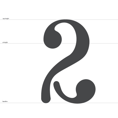
- ItalianStallion0
Number 2 - Version 1A/B
Just a concept, need some fix on line weight smoothness...
- looks good..neue75_bold
- pfowh thats niceRavdyk
- like this the best of all your submissionsneverblink
- ********0
i'll try a new T tonight or in the weekend
- kelpie0

- funkykelpie
- This is the kind of shape I assume Saul Bass might have used to frame his photos.shitehawke
- haha ian7point34
- jimbojones0
Keep em coming, folks, some nice ideas here, with a bit tweaking they'll be awesome! Neue's poster is a nice touch too, he will make a poster template then. Speaking of templates, for those of you who can't download from Dropbox, here are a few mirrors:
OSFA, you can make the @ (have fun, I would) and nobody calls multiples!
The lineup will be updated here >>> qbntype.tumblr.com
I will also post the WIP pics there, later.Remember, after the first round ist complete we will make lowercase.
- Maybe a stupid question, but are we going to get to work on the same letters?visual_infection
- Or will we have to bid again?visual_infection
- bid again, others should get a chance toojimbojones
- I concur. Thanks!visual_infection
- jimbojones0
johndiggity's Z

- ohh, lovely..neue75_bold
- nice !!!!!!!WeLoveNoise
- nice work johndiggity!jimzyk
- < coolTomBac


