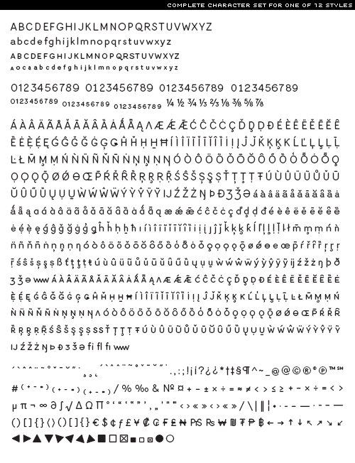
Learning to create a typeface
- Started
- Last post
- 23 Responses
- ********
What the best way to start?
- detritus0
Do.
- ideaist0
Draw it out in illustrator using a grid. Simply try to create a cohesive flowing character set and see if you're willing to spend the time it takes to perfect every single letter; both alone and next to every other character... I'm just getting into as well sir! Let me know how it goes...
- better draw in FL from the start, less pain in the arsejimbojones
- Benja820
start
- ESKEMA0
http://ilovetypography.com/2009/…
http://ilovetypography.com/2007/…be prepared for endless nights. It's very time consuming, depending on the typeface you want to make and the details you want to put in.
- jimbojones0
http://www.fontlab.com/typograph… for the tech side
Designing Type will give you basics on design.
Look at as many fonts as you can, learn from the best. Ask yourself why they did this and that.
- ideaist0
This pretty much sums it up...
- kerning and hinting is tougher than character buildingtypist
- Planning for any and all cases of each letterform use is a sickness... : )ideaist
- basic latin is pretty simple, add accents and voila. But kerning those fuckers... And programming OT features.....jimbojones
- d_rek0
I think ideaist is on the right track however...
I believe (and I think most type designers will agree) that going straight to the computer is not the best way. Start with grid PAPER and begin to sketch letterforms with a pen and pencil. This may not give you most uniform letterforms to begin with but it will help you greatly understand letterforms and how they are constructed.
From there you can always move into the digital realm.
- Yea; i draw worth shit... : (... It's important to try though... : )...ideaist
- ********0
Thanks for the tips - much appreciated.. going to look further into this.
Is typophile the best community for type designers?
- Iggyboo0
if your a beginner you might wanna try fontstruct.com
- TomBac0
Ok i would love if some one could tell me how could i design exact kerning for typeface. I remember we learned in school exact kerning space for Roman capitals and Monoblock (sans-serif, much like univers) i know that kerning was in percentage.
Sry im not native english and never learned one. I just don't know what to type in search engine.
- jimbojones0
There is no perfect value, all depends on the purpose of the typeface (display or text for example) and glyph shapes. The only rule is that horizontals need more space inbetween (H and M) than round/diagonal strokes (V and O)
- Jeah, this are the principles.
But I remember that there was rules.TomBac
- Jeah, this are the principles.
- d_rek0
TomBac,
In my experience, the way you would 'design' kerning would be during the production phase using software (ie: fontlab or fontstudio). You build in the space around a character with the software. You can then go in and setup the kerning tables with the software too. Kerning tables are what tells different pairs of letters how they should work together.
The only way i've discovered how to do this is not based on a percentage, but on rigorous testing at multiple scales and sizes in print and screen. And how you set the kerning and space around a letter is based on many factors.
- janne760
font design is for typographers.
- poop is for poopers.d_rek
- typographers aren't born sojimbojones
- ********0
I studied computer animation / graphics years ago - a lot of that involved techniques for curve creation (degrees of continuity / types of spline, and best-use cases etc) .. I guess that's quite important when working with type outlines.
I'm using linux as my main operating system at the moment, so I think I'm going to start out with font-forge (http://fontforge.sourceforge.ne...
- FontLab (demo) > FontForgejimbojones
- This sort terms I'm looking for.
CHeers.TomBac
- ********0
I'm also going to get hold of a

- TomBac0
Cheers all for answer. God bless.
- skwiotsmith0
Also, check out "Designing Type"
http://www.amazon.com/Designing-…
- Countryman0
counterspace!!! remember the counterspace is the most important!
Letters are things, not pictures of things!!!!
Maybe start with an h then b. that way you have a good amount of information for the rest of the forms in your typeface.
- design could be seen as a tightrope balancing act - refine between too much / too little .. until you can waver on the brink of the edge.********
- brink of the edge.********
- design could be seen as a tightrope balancing act - refine between too much / too little .. until you can waver on the brink of the edge.