The Independent Iphone app.
- Started
- Last post
- 15 Responses
- bergnatal
The Indy launched an fre iphone app.
http://www.independent.co.uk/lif…comments are welcome
- akrokdesign0
yeah, your time is way of. its not 9:42am. lol
- MSL0
Whoever created the user interface needs firing - train wreck of an interface. How do apps that look like arse, work like crap and are really unintuitive get into the app store? Anyway, The Independent app does not make me want to use it, so much so, i deleted it.
- typist0
Emigre / Arbitrary Sans Regular
http://emigre.com/fontpage.php?P…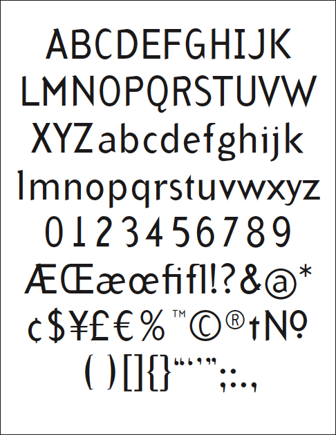
- must_dash0
How is that app unintuitive? you click on a category that has a number saying how many articles are unread, you then scroll though them, read one, and close it or bookmark it? How could it be any simpler?
The icons may not be to everyones taste but that is an aesthetic thing not an interaction issue.
- MSL0
Icons/aesthetic are part of the user experience and part of the user interaction.
A search option and a rethink about the main screen with the badges on would be on my list of things to sort.
But it still boils down to a rather clunky, nasty app.
- ********0

- ********0
"The icons may not be to everyones taste but that is an aesthetic thing not an interaction issue."
They're Mac users, dumb ass.
It's all about the icons. Doesn't matter if it doesn't fucking do anything, just as long as the icons don't embarrass them down the pub. No one wants to associate with an icon who turns up with it's trousers tucked in it's socks dropping 'shadows' everywhere....
- hahahashitehawke
- brilliant********
- quote of the day for sure... hahahaMeeklo
- must_dash0
thanks for clearing that up for me.
- ********0
Yeah graphic design is pointless isn't it what on earth are they paying us for
- ********0
It's buttons, with associated labels by them. They are clear and I can read them. Even with a slight nervous twitch I reckon I might be able to connect a finger with one of them.
Fundamentally, there is nothing wrong with the graphic design. It's just not very modern.
- and lacks quality. Icons don't communicate well, text is too small, etc...ribit
- Meeklo0

I haven't downloaded the app, but I'm not sure about those icons either. In the end the app might work fine as you say, but I think you get more downloads from non "The independent" readers if you were to work on the look of it a bit more.
Of course that is entirely your decision, I'm just being honest here.
- ribit0
Text is overwhelmed by the clunky icons. Really I wouldn't take this approach for a news app.. Apart from ugliness and difficulty in recognition of each item, I wouldn't take this approach to a news app.. What if I want to view only 3-4 categories regularly? Better to allow to select favorites and arrange them differently on screen, maybe in the lower toolbar area, so the main area displays news headlines at launch..
- rusty_ace0
I would opt for the head line page ribit described, and search bar at the top and a drop down that is part of the standard UI at the bottom with the category listed in it...Kill the ugly icons. Also i really don't think you need the number of unread topics, it clutters the interface. ultimately there are always going to be unread topics, people only have the time to read what interest them and could care less if you have content they are uninterested in.
- ********0
As opposed to light gray over black Meeklo (you know, like the iPhone UI.... again....) being the embodiment of clarity?
- In fact, if I squint, the application is actually clearer.********
- In fact, if I squint, the application is actually clearer.