Microsoft Gui design
- Started
- Last post
- 48 Responses
- jfletcher0
MS does suffer from over thinking... but it's a bi-product of what they do [and what they are]. Most of us don't have to consider things like multiple cultures, inter-op cases, DOJ issues, accessibility, multiple hardware cases and multiple OS versions.
Apple keep a closed ecosystem and therefore can regulate themselves better. Not to mention Apple was found by someone with more of a design mind centered around taste and beauty, versus a nerd with a strong business intellect.
They are simply separate companies build on separate models of success. Perhaps you’d like Google’s OS more. They have such innovation over there :D
- ukit0
I think it has a lot to do with management. Like everyone said, there are many talented and creative designers at MSFT, but there is not as much of a bold design vision coming from the top.
Could you imagine Microsoft having the balls to launch something like Wave and making that their main product push?
- mikotondria30
Someone needs to send Microsoft this thread, it really tells the truth about what I and everyone who can form a reasoned informed opinion about their products, thinks. And we've all been sat looking at Msft products day in day out, all day for the last 10/15 years..
Saying that, I 'quite' like the look of 7, and have heard good things about it, so I'll prolly actually be shelling out for a non-oem version, having bypassed vista entirely.
However, my wife is constantly swearing at her 'new' vista media player, I never use Word, or any Office stuff because it got too complex and counter-intuitive to use - there are far simpler alternatives... I don't know why they feel the need for this blanket domination of every aspect of my computing experience - just make operating systems, make them open-ended, cheap, reliable, innovative and don't be a dick about it - then everyone, including myself, will spend proper money it, and you'll be set. That's the only way to exist as a customer-facing brand in the next 20 years - thinking 'local' means occupying just the right corner of your customer's world, not trying to be General Motors.
- ********0
You´ve all got valid points like the fact that microsoft needs to take stuff like culture and branding into account before they release a product.
However, this does not explain why they do simple mistakes, like fall intro the trap of making stuff transparent just because it looks cool..
Remember that Apple are facing many of the same problems and are solving them with ease. I think the main difference between apple and microsoft is that Apple make their apps top-down, while at MS they start at the bottom.
- ninjasavant0
I'm assuming that MS is like most big software companies with the Developer to UX person ratio being something like 10:1 or worse. What this means is that its impossible for the UX teams to design or monitor everything so what you get is code jockeys that think since they can use it or since they think it looks cool it goes into the product. And since management rarely has any sort of vision related to the user experience or design, it passes.
Its not a failing of their design team, its a failing of corporate development management who don't drink the design kool aid.
- ********0
But after all the product they have released shouldnt at least one manager have realized the importance of good design???
- jfletcher0
invo - Apple doesn't solve anything with ease. They work their ass off there. However they do have clear direction and cases to support. They will choose carefully what to support even if it means alienating users.
Ninja - 10:1 would be on a good team :) It's simply a different culture. I have a hard time saying anything is failing when you have the revenue MS has :P Perhaps it's not good design to designers, but it's not a failure of software.
- yeah, 10:1 is a luxury we'll never see. Frankly I don't think our sales people get paid enough given what they have to demo.ninjasavant
- to demo.
I agree that its not a 'failure' in terms of getting the job done.ninjasavant - Just a failure in prioritizing what we devote our lives too. Thats why I've shifted my focus to more broad guideline development.ninjasavant
- development as opposed to taking the fight one project at a time.ninjasavant
- ukit0
My main gripe with them is, why don't they fix IE? I can choose not to use Windows or MSFT software, but as a web designer I can't choose not to design for IE on a large scale.
There are so many annoying problems with IE and I have no idea why one of the biggest software companies in the world can't fix them over the course of say, a decade or so. Granted it has gotten better but if Google can pump out a standards-based browser in a year why not MSFT?
And now they are once again the odd one out not supporting some of the non-proprietary features of HTML 5 such as Canvas.
Personally, I think it would be a great move for MSFT to appoint a new VP for web and stop acting like a little bitch when it comes to the web.
- jfletcher0
invo - re: realize good design is important - Here is the issue. They became the largest software company in the world without good design... so why is it needed? (is somewhat the attitude) This type of attitue is changing as you can see with their latest products, but with 90K people, things don't change over night. I do see changes in them, and I believe there will be a stronger focus on design in the coming years, but never expect the same as what Apple does. It's impossible for the most part.
- You might be right. I just think they are making simple mistakes over and over again...********
- not going to disagree with some of that :Djfletcher
- You might be right. I just think they are making simple mistakes over and over again...
- ********0
Although the two are very much connected, there is a difference between usability design and pure graphic design. As I´m sure you would agree with me on, that the latter should be used as a tool to achieve good usability.While I think MS isn't all that bad with regards to usability design I think their products suffer from the fact that they just don`t look and feel elegant. They are seldom easy on the eye and it often looks like the graphics where designed after the application and that there is little quality control.
Apple excels at combining the two and I reckon they spend months creating pixel perfect mockups before they write a single line of code (you are right jfletcher, I do think they work their asses off). I once read that an apple product chief used a real magnifying glass to examine every pixel of an application. Maybe a bit overkill, but the devil is after all in the details and your code might be excellent but users will think its crap when they see bad graphics. Consciously or not..
- ukit0
Apple is a company that made their name on being "the best" at design though. Microsoft is not THAT bad in the grand scheme of things. Look around. Most of the web is ugly. Google is ugly but people tolerate it because they are innovative and great usability.
- ********0
I think google is where MS was years ago, functional, simple design. No bullshit, no slightly transparent popups for no reason, no fugly background images, no strange looking palettes for applications and animations that server no purpose other than to slow down your machine.
- designbot0
Honestly I don't know what some of you are on about. Step away from your fanboyism for 2 seconds. Compare the two screenshots below, please explain to me why you think OSX is so superior in terms of design over Windows? They both look nice to me. Like I said on the previous page, Apple is good at keeping things simple, but as a result you don't have the control that you would have over a PC running Windows. On the same note though, Windows could do a better job of not overcomplicating things...like some of the more robust features could be hidden so as not to confuse the average user. But at the end of the day, based on pure design I don't see the superiority of Mac that alot of you are going off about.

VS.

- Mac has cooler bg image;)ukit
- I would say true, but I am biased to all things space :)designbot
- all things space = raddesignbot
- try opening some windows next time********
- +1 to Fiesta
Not_Just_Another
- ukit0
I think you will see UI be more innovative as the web becomes the default platform. You won't have to go to a Microsoft or Apple or Google solution anymore.
We can build it, guys. We can build the future.
- ********0
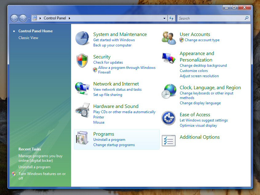
designbot: Ok, lets look at the difference between the control panel. Of course, these are my opinions, but I´m sure many of you share them with me.
- Whats up with spending 30% of the left screen for basically nothing, forcing an "additional options" to be packed in a separate screen. Apple fits 30 icons in the same space as 10 without seeming crowded.
- And whats up with the left background image? Green and blue, with some strange ribbons? It aint pretty.
- As I´ve mentioned before. The vista application frame takes up far more space/pixel than it should.
- designbot0
regarding the "with spending 30% of the left screen for basically nothing"
Depending on what you click the left panel is populated with different options. So it may be (depending on what you click) that this entire space is filled. Curious, have you ever used Windows Vista or Windows 7?
I see what you mean with the space some things take up, but that seems pretty subjective to me, as do your other comments.
- I´m actually a developer and write code using .net on a daily basis. Absolutely lovely framework.********
- Using Vista ;)********
- I´m actually a developer and write code using .net on a daily basis. Absolutely lovely framework.
- ********0
windows users are white trash
- ********0
Seems pretty much empty regardless of what i select on my machine... Windows Vista is probably their best product in terms of design. Take a look at the default setup of Live Messenger..

How many percentage of the windows is actually used for the applications main purpose - chatting? The background image is pretty nice, but i think this application has some serious deficiencies...
- you can minimize all that stuff...picture, menu. Do that. Then it's simple as shit :Djfletcher
- It still steals a lot of my precious screen space...********
- jfletcher0
ukit - I think there is a big divide between personal and enterprise use here. Web may become more personal, like iPhone apps, but for the enterprise, you're not going to trust some unknown vendor for your security.