Really Really Bad Logos
Really Really Bad Logos
- Started
- Last post
- 27 Responses
- shapesalad0

- A LES ISdbloc
- I love my Alesis monitors thomonospaced
- A Les is ʾakbaruutopian
- Hmm... very nineties, but... fine? I'd make the A same height as the rest, tho...jagara
- utopian-2
One of the worst logos of all time.

- Universally hated, case study for worst logo ever at design schooljagara
- I still like it. It's almost shit cyberpunk, which is why I like it even more nowIanbolton
- lisa simpson fellating a headless manBrabo_Brabo
- At least it stood out from the usual Olympic blandness.Chimp
- This whole identity was great. It did exactly the job it needed to do: cut through visual noise throughout london.BaskerviIle
- Put it in a lineup of other olympic logos an you'll see it cut through all the dull brush stroke logos. A logo doesn't have to be pretty to be effective.BaskerviIle
- https://www.999desig…BaskerviIle
- Yep, the whole system worked very well. You could take the logo away and you’d still know it was London 2012.Chimp
- 201'2?sarahfailin
- _niko1
Just terrible

- ROTFLsted
- another guru.com specialhans_glib
- The copy doesn't even follow the same path as the inner or outer circles!
Well I guess it's not as offensive as this...
https://celebrityacc…fooler - This was surely designed by a bunch of suits_niko
- They should have just left it!section_014
- As "Football Team", that is.section_014
- So glad i saw someone posted this...
RIP to my old Redskins/WFT.slinky - I've been a Washington Fan for my entire 48 year existence.. i'm sad and embarrassed by this crap.slinky
- mort_-2

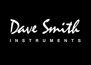

- Great synths but logos designed by an eighth grader with Corel Draw Litemort_
- not THAT bad. Def has that early 2000's lookhydro74
- Aren’t those all default windows fonts?scarabin
- The top and bottom logos predate windows. The sequential one is still being used on new products. In-house “design” no doubt.mort_
- I think they still work. Reminds me of the Avatar/Papyrus logo. Sometimes even Comic Sans feels right! Maybe they've been around too long to warrant changing?Ianbolton
- i remember when they came out they already looked old fashioned. and that shitty uncial, really? but then again, the synths sounded brillianthans_glib
- Original version of the Sequential Circuits logo was even worse:
https://synth.market…mort_ - Just copped the Dave Smith logo uses the same font as the NWA onemort_
- @ mort_ yeah it's the classic Mistral
https://en.wikipedia…)grafician - Clumsy logo=High end music equipment. For some reason.jagara
- _niko0

seems as lazy as it gets. unless I'm missing something? is the A a chevron for the land down under or something?
- I guess it's a step up from the old one
https://i.pinimg.com…_niko - I think it's good. Simple, recognisable. The A and O are used in headlines and illustrations to support the brand and add dynamism. It's been around for...Morning_star
- ...nearly ten years and has evolved along with the tennis tournament itself. IMO it's strong and honest, it works.Morning_star
- I also think it's good. In this context < it looks simplistic, but at Melbourne Park it stands out against the huge amounts of sponsor branding etc.MrT
- and the blue is unique to this slam - the court colour. I'm off next Monday, I'll get you a towel : )MrT
- Reminds me of a healthcare company logoutopian
- I guess it's a step up from the old one

