Really Really Bad Logos
Really Really Bad Logos
Out of context: Reply #25
- Started
- Last post
- 27 Responses
- mort_-2
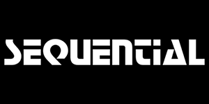

- Great synths but logos designed by an eighth grader with Corel Draw Litemort_
- not THAT bad. Def has that early 2000's lookhydro74
- Aren’t those all default windows fonts?scarabin
- The top and bottom logos predate windows. The sequential one is still being used on new products. In-house “design” no doubt.mort_
- I think they still work. Reminds me of the Avatar/Papyrus logo. Sometimes even Comic Sans feels right! Maybe they've been around too long to warrant changing?Ianbolton
- i remember when they came out they already looked old fashioned. and that shitty uncial, really? but then again, the synths sounded brillianthans_glib
- Original version of the Sequential Circuits logo was even worse:
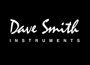
https://synth.market…mort_ - Just copped the Dave Smith logo uses the same font as the NWA onemort_
- @ mort_ yeah it's the classic Mistral
https://en.wikipedia…)******** - Clumsy logo=High end music equipment. For some reason.jagara