new quicktime logo
- Started
- Last post
- 19 Responses
- ********0
everyone hates it
- marychain0
Doesn't really improve on the old one does it...just different.
I don't like the purple...but that's just me
- monospaced0
My thoughts are that those guys over at Brand New aren't nearly as snarky as us assholes.
- maybe they're just stupid?********
- maybe 'we' are just stupid?janne76
- maybe they're just stupid?
- janne760
fits with the new direction in terms of overall design @ Apple.
- ********0
The redesign doesn't seem interesting to me, and I can't imagine it took much effort. But I may well be stupid.
- i think you are just young. enjoy it while it lasts. :)janne76
- I'm only two years younger than you janne .. don't you think some of those comments seem a bit sycophantic / fawning?********
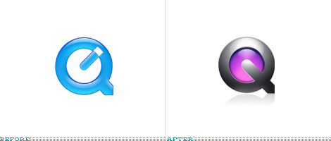
- It's Q with a gel background and a highlight.********
- Yes, that is what it is and fits the rest of the brand. Consistency is key.janne76
- design is not about what we designers like, but what will work on the market (etc.)janne76
- that's very true - but should the successfully executed milestones in a brand's implementation strategy be celebrated?********
- celebrated?********
- I see what you're saying though - I just can't see how it's anything to become excited about :)********
- kult0
Already posted.
- quamb0
without all the purple and 3d shading - the logo could actually be a pretty nice refinement of the quicktime "Q" mark.
- letters20
To monospaced's comment – I am one of those guys over at Brand New. We just try to keep it constructive.
- cosmoo0
it's hal.
- janne760
my only pet peeve with the logo is that they made it look rather heavy due to the deep metal 'bevel', the dramatic lighting (HEAVY shadow!!) and the tail of the Q pointing down as an arrow.
the combination of those factors make it look like it is a heavy application that would demand a lot from their consumers. A.k.a. it has that 'pro'-application look. While Twitter for instance goes for the featherlight feel and to me, seems more inviting to a broader group of people.
Perhaps, after this metal rage at Apple, they will return to a more natural look, who knows.
- Agree. Should be lighter, and I like the cap on the old clock-hand.ismith
- ********0
thats nasty (to me).
doesnt matter, anyways.
- utopian0
another dropshadow
- eating_tv0
Why why why why why why WHY!? Why the fuck fix something that ain't broke?! AGAIN!?
- mikotondria30
to keep the brand fresh and mobile - in a marketplace like that of quicktime, a year is a long time. Users need to see the brand responding to and actively adopting a position within the current movements of markets, technologies and public perception.
I think they've done just about as well as they could in terms of nudging the identity of the brand pretty accurately, I like the greater area coverage, but I think with the treatment it's had it does seem a little weighty. Would like to see it with less bevel and general drama.
Overall it's not spectacular, but as a way to move the identity forward by abandoning that aqua and looking relevant in a post 2.0 world, they just about nailed it.- I don't understand why they don't integrate DVD player with QT, would at least justify it as a total media player.ismith
- wow that is some hardcore marketing speakPupsipu
- its not meant to be, Im saying that from a consumer pov. Everyone knows this shit, even if they don't express it.mikotondria3
- NONEIS0
I have to say, this made my eyes bleed when I first looked at it, but a couple days later, and my only quip is the purple core, not fond of that color being a part of the OS X brand in any way, but it's on brand in terms of Leopard and all that space crap they have been doing so, I can't blame them for going this route.
- nikdaum0
I wonder why they didn't keep the core blue?


