new quicktime logo
new quicktime logo
Out of context: Reply #13
- Started
- Last post
- 19 Responses
- janne760
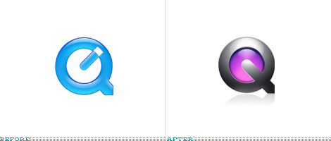
my only pet peeve with the logo is that they made it look rather heavy due to the deep metal 'bevel', the dramatic lighting (HEAVY shadow!!) and the tail of the Q pointing down as an arrow.
the combination of those factors make it look like it is a heavy application that would demand a lot from their consumers. A.k.a. it has that 'pro'-application look. While Twitter for instance goes for the featherlight feel and to me, seems more inviting to a broader group of people.
Perhaps, after this metal rage at Apple, they will return to a more natural look, who knows.
- Agree. Should be lighter, and I like the cap on the old clock-hand.ismith