I need educated Opinions...
- Started
- Last post
- 31 Responses
- ********0
I didn't even finish high school, but I think this one will eventually get there, as you tinker with it over the next few days
- neue75_bold0
have you tried making this dual line instead of just one? I think it's too fine and weak as is...
- also makes you look like a seamstress...neue75_bold
- could always drop it out of a solid talking bird or something********
- or a soiled bird...neue75_bold
- ********0
as mentioned before, the initials TB immediately make you think of a certain, rather fatal disease. Probably not the best choice.
On top of that it looks shit, fancy gradient background or not.
- i can smell your TB sheets on your sickbed.7point34
- YOU'RE NOT MY DOCTOR!!********
- DOCTOR?********
- What's wrong with constructive criticism? You are an intermediary with humanity, aren't you?Andrew_D
- if you were a doctor you would excel at issuing fatal prognoses********
- he'd get sued loads, regardless of skill. folk sue nasty doctors, rather than bad doctorskelpie
- i wanna drink of water. i wanna drink of water. somebody go in kitchen and get me a drink of water7point34
- Just as well I'm not a doctor********
- talkingbird0
editing the spacing in the "B" right now.
- Why aren't you doing this in Illustrator? No?Andrew_D
- The word "easier" should have gone in front of "now".Andrew_D
- *lowers head at lack of keyboard skills*Andrew_D
- its based off a font and i'm basically selecting lines and editing them by eye which seems to be epic failing
talkingbird
- kelpie0
I'm not sure how you're doing this in PS but if you've got Illy and can use it I'd switch across pronto.
The problem I think with it is that unless you get every dash, and every space between the dashes exactly right, it looks like 4 separate lines and has no cohesion

and anyone looking at it will just think it "looks a bit off" even if they don't understand quite why. This is a simple idea which ultimately means its much harder to do than anything else and has to be perfect or you may as well dump it.
Consider Illy and consider doing some reading on using scripts so you can use those things I posted
- Scotch_Roman0
What kelpie said.
I recommend using dots instead of dotted lines. Like so:

- also, you'll note he has used mercury which gives it a "timeless" quality7point34
- ;p7point34
- subtle..neverblink
- hahahakelpie
- hahaha, a man's gotta stay on brand.Scotch_Roman
- hahahaha********
- neverblink0
Where is the fun in this design? I'd opt for something like this..

;)
- vet!janne76
- haha, dank je :)neverblink
- +1 Dashed lines say: unfinished, not confident, needing guidance.
Rethink from the ground up.BRNK
- janne760
or try to make it more an abstract clear symbol that doesn't look too much like letters shoved into each other.. eg:

- neverblink0
I didn't spend a whole three minutes making that ridiculous logo for this thread to sink into the qbn-abyss!
- dyspl0
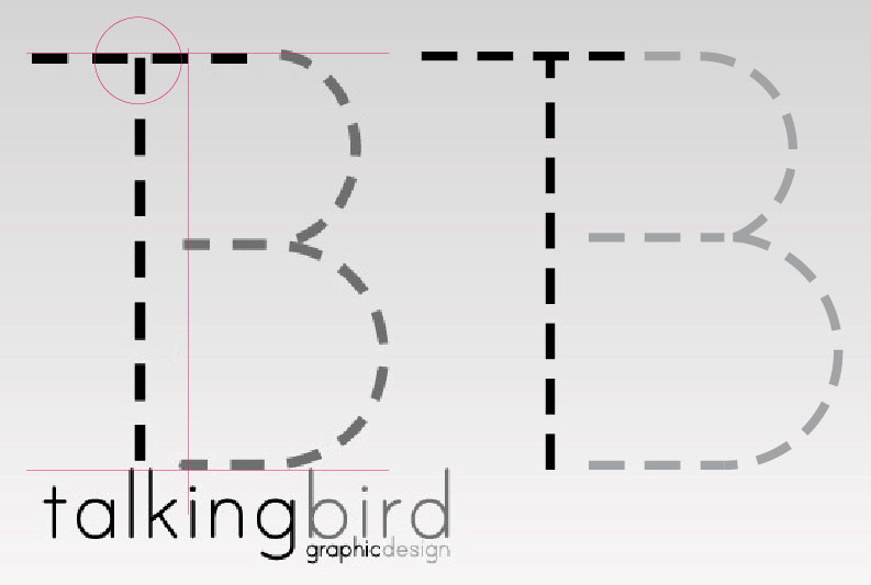
- the one on the right is better. the bottom of the T needs to aligned with the B for sureforcetwelve
- still needs improvments anyway, like the spacing on the B between the middle line & the circles, forgot to put the right T in black etc
quickly donedyspl