DIN Next
- Started
- Last post
- 50 Responses
- ukit0
I don't think it's necessarily interchangeable with those other faces though. Din has its own personality which is different from those....although if there is a better drawn face out there in the same vein I'd love to see.
- typist0
it's the lowercase "l" and "a" that make me fall in love with din
- Mau0
I am not a huge fan either but I don´t think you can compare it with other usual sans serif faces....its to arbitrary.
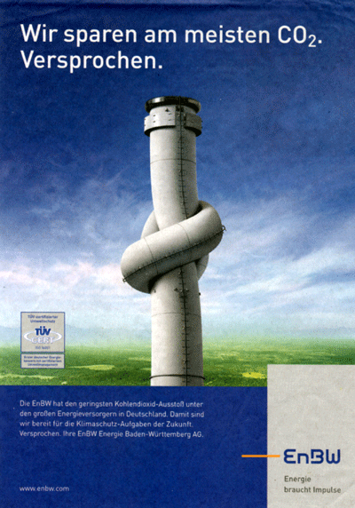
It works well for clinics, electric- energy- chemical- medical- etc companies, or for german freeways ;)
- ukit0
Do you guys have an opinion on best version of Din? They are all pretty different.
- typist0
FF din is the best version so far...
- Mau0
- Mau0
- do you have DIN next? How does it compare to FF?********
- hmmmmmMau
- not sure..Mau
- I don´t have it... I wrote DIN Next with FF Din, ;)Mau
- hehehehe********
- although you don't have it, which do you think you prefer?********
- is this a rhetorical question?Mau
- not rhetorical--from comparing them online, I mean********
- FF DIN.. beautiful alternates.. and also the numbers are lovelyMau
- do you have DIN next? How does it compare to FF?
- ********0
I almost feel like in cleaning it up too much, the industrial charm may be lost
- Mau0
- ********0
what do you think of avenir next compared to avenir?
- I see what you are trying to aim at..Mau
- I'm serious********
- if someone else has thought about it already, I don't have to********


