Logo Crit
- Started
- Last post
- 50 Responses
- akrokdesign0
the symbol has way to much power over the text, need to be a bit smaller. or text larger. the ™ mark is way of. just cause you can break the rules don't mean you should. :-)
i do not like the gradation but then, i dont know who's the target audience. if its works with them, then ok.
- akrokdesign0
or the CD version of my comment.
just jazz it up a bit. lol.
- typist0
irelevant
you enjoy graphic design don't make you a professional designer
you do good work, you get regonized, it's that simple
it's stange to me that you ask comment and opinion here but you never listen, like the ecoseek logo, i saw the final logo, how many ppl here told you to notice the kerning, and the oddness shape of the hip. btw, you don't know what is ligature, do you?
- akrokdesign0
yeah, when someone is critiquing you work. best thing you can do its chill.
- McLovin0
OK, but no kissing on the first date...
- akrokdesign0

lol
- McLovin0
LoL! Think the ligatures need improvement!!!
Nice one akrok
- McLovin0
I know mate, it was ref previous comments.
- akrokdesign0
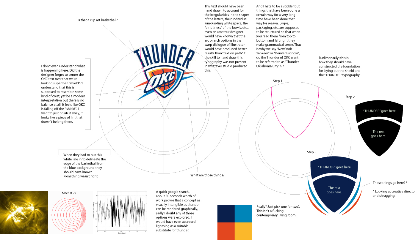
logo critique... (click to enlarge)