Logo Crit
- Started
- Last post
- 50 Responses
- akrokdesign0
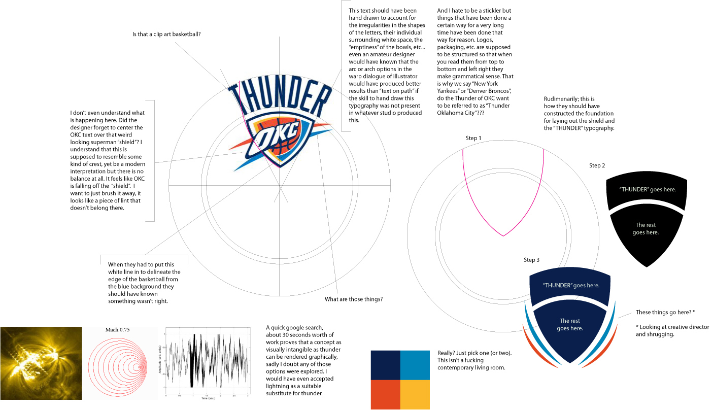
logo critique... (click to enlarge)
- McLovin0
I know mate, it was ref previous comments.
- McLovin0
LoL! Think the ligatures need improvement!!!
Nice one akrok
- akrokdesign0

lol
- McLovin0
OK, but no kissing on the first date...
- akrokdesign0
yeah, when someone is critiquing you work. best thing you can do its chill.
- typist0
irelevant
you enjoy graphic design don't make you a professional designer
you do good work, you get regonized, it's that simple
it's stange to me that you ask comment and opinion here but you never listen, like the ecoseek logo, i saw the final logo, how many ppl here told you to notice the kerning, and the oddness shape of the hip. btw, you don't know what is ligature, do you?
- akrokdesign0
or the CD version of my comment.
just jazz it up a bit. lol.
- akrokdesign0
the symbol has way to much power over the text, need to be a bit smaller. or text larger. the ™ mark is way of. just cause you can break the rules don't mean you should. :-)
i do not like the gradation but then, i dont know who's the target audience. if its works with them, then ok.
- Ruffian0
Reminds me of Neuarmy' logo but much worse.

- irrelevant0
typist: I don't design to get on EC of QBN, nor do I enter design awards or design to get commercialized. I do what I do because I enjoy it, and all I asked for some simple opinions. You don't like it, enough said.. move on your majesty.
When you come down off your design pedestal, please grace us with your identity designs so we all can learn how to get published like yourself..
- McLovin0
It may qualify you to comment, but it doesn't qualify you to be nasty does it?
- McLovin0
The ego has landed
- typist0
irrelevant, since when people here need a portfolio to make comment here?
let me tell you some facts, my site was on the QBN/EC, my logo design are in over 10 different logo books that are published by taschen and Gestalten, so does that make me qualify to comment? it's not even relevant at all!!
truly pathetic is your logo design, not people without their own portfolio showing here. so you are saying your logo is not copying (since when redraw is not copying)? and your typography on this logo is top notch?- go refine or redesign your logo and come againtypist
- I don't know, it may take me a long time to find something simple to trace.irrelevant
- irrelevant0
You know, I don't mind a logo being critiqued but for words like "big fail" or making references to me copying is truly pathetic especially coming from people WITHOUT their own portfolio.
Over the years I have sort of lost respect of what QBN used to be. Keep in mind, there was some decent design feedback in this thread, but to those who lack a portfolio of your own or simply don't know how to critique, you probably shouldn't respond..
- I like the design mate, and there some good detail in there. Just work on the type some more.roundabout
- WeLoveNoise0
i think the logo loks great
as airey said earlier tho - the intials need giving more depth maybe looking like there pressed in or something because they do just look like it been plonked onother than that spot on
- irrelevant0
I didn't download a vector from iStock Photo. I did a search for ranking patches and drew it in Illustrator. Every Sergent patch is going to look the same..

- gramme0
eh, no.