design crit thread
- Started
- Last post
- 80 Responses
- ********0
going to back to the black and white one, I assumed the cropping was achieved as a result of a random process which they declined to alter to make it look "better"
- ********0
We have reached the stage in design where most things have been done. 50 years ago a nice orange circle acrylic painted onto a black background might have been pretty nice, now I would just say 'why the fuck'?
I think if you are going to attempt to achieve this sort of design (black typography on white background) - then at least make an effort.
- although for some reason I just compared design with a piece of art********
- although for some reason I just compared design with a piece of art
- ********0
#3

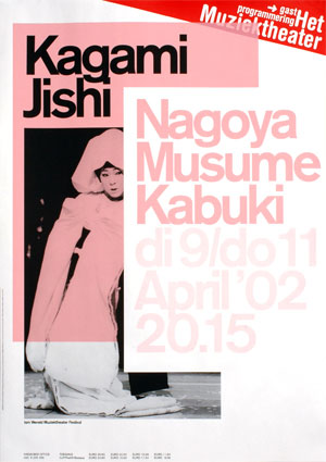
- This feels really uneasy. the type needs to be shifted over at least half way between the two chairs********
- I like that it makes the line at his knee rather than a more 'balanced' point on the pagekelpie
- i think for me that's what makes it feel uneasy********
- try keeping it between his shoulders. the overflow on the right is what's bothering mezenmasterfoo
- ?Albertomelo
- This feels really uneasy. the type needs to be shifted over at least half way between the two chairs
- chossy0
I like the coloured one also :)
- kelpie0
^ I either like this, or it worries me greatly.
If the information on it has a purpose, and no filler (to make it look a bit more pretty, and possibly more purposeful), then I like it, cos to be honest I still think its hard to beat an intereting photograph with some typography to complement
- neue75_bold0
it's all rubbish, where you going with this, sir?
- confirming my own apocalyptic thoughts about my future viability as a wage earning citizen********
- time to shift paradigms?D_Dot
- confirming my own apocalyptic thoughts about my future viability as a wage earning citizen
- chossy0
The photo one does nothing for me unfortunatly.
- kelpie0
that was my thoughts on the 2nd one, I honestly couldn't even dredge up an opinion. it was pretty I guess, but...
- ********0
- surely some of you will like this, as it employs a common current move********
- Ex Jetset?kodap
- surely some of you will like this, as it employs a common current move
- neue75_bold0
90% of the good images on ffffound were created 20+ years ago, the rest [my stuff included] is either a poor attempt to at least create something purposely uninteresting, the others are poor attempts to create something that can only be labelled 'interesting'...
- a profession in crisis********
- fyi - when someone labels your work as 'interesting' it's a polite way of saying 'I have no real use for it'neue75_bold
- and ironically 'interest' in it..neue75_bold
- nobody ever even tells me my work is "interesting"********
- I think this is a majorly broad statement with next to no weight behind it. But I somewhat agree.********
- a profession in crisis
- ********0

I would say that this, even though being so much more simple, is alot nicer than the first two you posted, because it works. It may not have much wow factor but you can't really fault it either.
- it's ok with me********
- contextually this works as hedi's photos are impactful b/w.johndiggity
- it's ok with me
- ********0

- holy shit, is that trajan?********
- Maybe it's a movie poster disguised as a catalog.blaw
- holy shit, is that trajan?
- kelpie0
So its basically been shite since the process changed and everybody got a hold of computers, neue?
- neue75_bold0
I don't know what the fuck happened, all I know if my ass hurts and I've got one helluva headache..
- ********0
for all the protestations, I think people would rather talk about funny youtube videos or television shows
- kelpie0
non design talk is only an issue when someone wittier than you has made you look a dick on the internets.
- Jaline0
*takes all of snuggles' work off
- kelpie0
you know what rand? I really like the last thig you posted. I likw it because I like the colour, and I like the proportions, and for no other reason whatsoever, though I'm not a big fan of trajan. What the fuck is it trying to do though? or is it literally just going "look at me, I'm a nice red, on a nice stock and I'm well proportioned. Love me, it ok"