xmas card?
- Started
- Last post
- 40 Responses
- Meeklo
Help me decide please
1 or 2?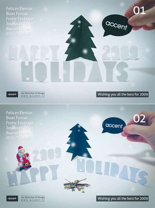
- ********0
2
- fix the text top left though...********
- and bottom right.********
- in fact, remove all text. you have your logo in the photo already.********
- agree. remove all the copy
GrandChamp
- fix the text top left though...
- Jnr_Madison0
2
- ********0
2
And great job. Love it.
- aaux0
fix the type and choose direction 1
- ********0
i have changed my mind, if you remove the text, 1.
- ********0
2, even though the santa is kinda redundant IMO. also the grey thing in the bottom right, the text is positioned kinda odd ("2009">right margin)
- it's the shadow of his hand, no?Helvetica
- oh, didn´t even see that! was refering to the text box, right bottom.********
- Helvetica0
1. v nice
- Jnr_Madison0
I don't like the santa now. So I am now undecided.
- In fact, 2 looks very similar to the one you done before.Jnr_Madison
- exactly! that's why I liked number 1 cause its a bit different than the previous oneMeeklo
- Meeklo0
I was more inclined to number 1 as well, but the type is still a mess, I might try something else tomorrow, but it will be one of those 2 images, I wanted to see, which one is more popular.
Thanks everyonessss and feel free crit or send comments/ ideas
- the hand in the 2nd one has the better angle, better colours too.********
- I can fix that in photoshop, it looks more desaturated w a bit of blue I guess, thanks 4 the tipMeeklo
- the hand in the 2nd one has the better angle, better colours too.
- ********0
i have changed my mind, i can't decide now either.
- marychain0
1
nice!
- sfeske0
i'd go with 1, i like the layout
- airey0
both.
- boobs0
2
The wee Santa bought my vote.
- iCanHazQBN0
wouldn't it be 2008????
- it says holidays, I would imagine that includes new year. Isn't it obvious? I'm asking cause this could be a problem.Meeklo
- Gucci0
1.
gotta fix the text in the top left so it's legible though.
- KevinTx0
1
- janne760
2 is more playful, less corporate. :)