Serif small caps
- Started
- Last post
- 18 Responses
- embarko
Anyone know of some good serif small caps like Trajan and Hoefler Titiling:
- dog_opus0
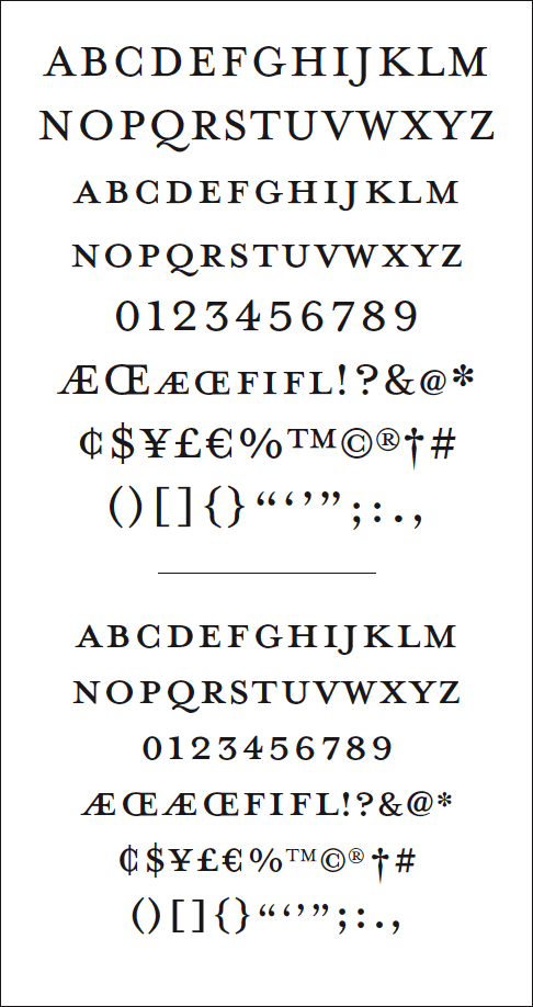
I'm quite fond of Minion Pro's small caps myself. I actually love that entire face.
- janne760
- long time no see Feijoa!
it's curves just gave me a boner
:o)VectorMasked - Feijoa indeed!jaylarson
- long time no see Feijoa!
- ********0
I'd take Garamond, Minion, or Caslon over Mrs Eaves. Jensen is also nice. (All Adobe Fonts).
- jap garamond is the original... mrs eaves is so la lamoamoa
- moamoa0
>copy< just an example:
Mrs. Eaves may be be chique, fancy, fresh, charming, cool, "feminine", beautiful etc etc.
But it has rarely anything to do with good typography. It is superficial, shallow and, in short, an abomination.
It is a failure of ITC Garamond proportions.
Use it as you wish.
It may bring you luck, it might even bring you typographical insight, but do not set any amount of text over ten syllables.I'll leave it to the good people of Typophile to explain the finer details of the relationship between the x-height and the ascenders and so forth, while I, in desperate need for more nuance, go and polish my english typographical vocabulary.
>why Mrs. Eaves has become such a very popular font in such a short time
Market Presence:
*unexpected paradigm style shift for the famous Ms Licko/Emigre
*clever name (yeah, I know, Mister Frisky was first...)
*good promotional materialNovel features:
*smart ligatures
*two sizes of small caps
*unicase variantDiscreet presence:
*Small on the body (an Emigre trope)
*Open fit
(These combine with solid color to create balanced weight.)- i never paid attention to it but it has a very low x-height, which can be annoying in large amounts of text..janne76
- http://www.emigre.co…janne76
- when I saw it first in example sheets, I liked it.. but while I try it I have a bad feeling taht something is wrongmoamoa
- as you said espacially in long copy.. works well in headlinesmoamoa
- VectorMasked0
I love it.
I think a lot of people wanna sound cool, knowledgeable and old school by going with the 'original' baskerville than Mrs Eaves.
- like this -->>
HELVETICA 4 LIFE!!!!!
VectorMasked - yeah that's what i always figured... it's kinda become designer-cool to say mrs.eaves is weakhorton
- Mrs. Eaves, meet Mr. Rotis.dog_opus
- Mrs. Eaves and Mr. Rotis in their new-found love should perhaps move to a desert island and never come back.********
- like this -->>
- ********0
for certain applications, requiem
- vanilla_cam0
sabon
- Jan Tschichold's reconciliation with the "Old Typography."dog_opus
- moamoa0
Mrs. Eaves isn´t weak... I think its just not so good as many people think, compared to baskerville or garamond... did anyone of you ever try to place many copytext with Mrs. Eaves? - good luck
but anyway its a taste thing.... I would always prefer Akzidenz Grotesk before using Helvetica...
- jaylarson0
Centaur has its moments of glory too:

- gramme0
Mrs. Eaves was originally designed to mimic the look of the original Baskerville as it appeared on a letterpressed sheet. However, it's small x-height is very annoying. Mrs. Eaves is really more of a novelty typeface than a practical workhorse. It's very postmodern: mimicry of old fashioned printing techniques, rendered in the digital medium.
I'd rather just go to the original Baskerville and call it a day. Readers will thank me, too.
- gramme0
Mercury has some very attractive small caps.

- dog_opus0
gramme knows his stuff.
- embarko0
Thanks for all your help guys, I reckon i'll go with Minion Pro.
Cheers