Logo Crit
- Started
- Last post
- 47 Responses
- Iggyboo0
Why all the hate on this mark. It's not that bad. It's a cross between a contemporary Nike feel and that Faddy style that's reverting back to 70s block typefaces. I don't mind it DJ's are faddy, give a full critique and a reason why it's not working if your going to take pot shots.
- dirtydesign0
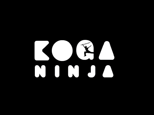
The letterforms of KOGA look strange. Maybe try to make them all have the same feel, like they're all 1 font.
- rybo0
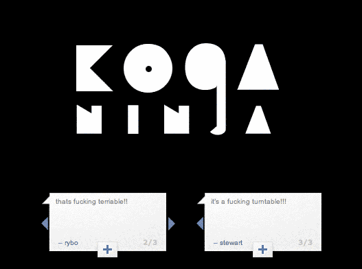
Iggy cheers fella, come guys im open to critaism and here is a rejig

- this is actually better. The odd G counter will disappear at small sizes though, I say lose it completelyBaskerviIle
- That G is hurtin. The k, o and a feel like shapes. The G is not a shape or a letter.dirtydesign
- J needs some attention.janne76
- rybo0
i have just took the counter out of the G and it looks like an lower case A
- ismith0
You can still have a unique counter on the G, just not the one you're using imo (for the same reasons everyone else has said).
- Dancer0
better.
The J needs some work as well
- Spookytim0
I'm no fan of the blocky black and white style, not this far down the road anyway, but I can see it has the right sort of mood for a DJ.
I think the KOGA word is very crude. The K is quite poor and the G is pish imho. The Ninja lettering feels more accomplished so maybe take that as your starting point for the KOGA bit and adapt it / thicken it / play with the rounds if you want to make it feel different.
Close up the spacing though, and range it left. You have vertical strokes to align on the left, but two diagonals on the right - so attempting to centre it will need to be done optically and will be a bitch to get absolutely right I think.
Don't white-out type as thin as that from a deep chunky black. It will get eaten in all but the very best quality print.
That would be my two penny bit. Apart from that, I appreciate the look is generally right for the task in hand.
- rybo0

- MSL0
How about making the A properly pointed and not with a flat top... would give it a bit more of a sharp feel. Can you make the O and G a full cirlce not some odd oval shape? Also the K is really annoying where the indent is not symmetrical and centered on the height.
- 23kon0
makes me think of

and the way this was stencilled in every city centre to promote the album.
he shoulda got a HUGE fine for that imo.
- Spookytim0
Hate to say it but I think you've addressed various criticisms, but to the detriment of the logo's personality. That's just my personal opinion though as I felt the original NINJA lettering was nicer than the KOGA lettering, and the latest version is working purely with the KOGA lettering. I don't think the G is there yet, I still hate the spacing and if it were me I'd be looking at making it a one word, or hyphenated, or one line logo not a two word stack... just to see how that looked. Koga & Ninja are not mutual words so it almost feels like two DJ's when stacked like that.
- Tell Him to drop the Ninja. How many millions of "NInja" DJs are there out there. Koga is nice, unique.Spookytim
- ********0
reminds me of a friends logo for his night. which i think is done quite well.
- ********0
- rybo0

- neue75_bold0
lose the counter in the 'G' completely, or if you keep it, just make it a straight line, make the stem heavier.. create a better unity in spacing... Ninja could be bigger and use a more similar kerning to Koga...
try a version that is more slanted as well...
- Raniator0
I love it. Well done.
- gramme0
I'm afraid I'm not feeling the fiber of your fabric. It looks bloated. The G is unattractive and won't hold up well at small sizes. The filled-in A is cliche. The letters KOGA are spaced too wide, my eye immediately goes to the holes, which are not well kerned. Rounded letters are fine, but those used in NINJA are too fat. They look clumsy.
Sorry to be such a downer, but I think you need to explore other directions.