late night logo crit
- Started
- Last post
- 23 Responses
- tymeframe
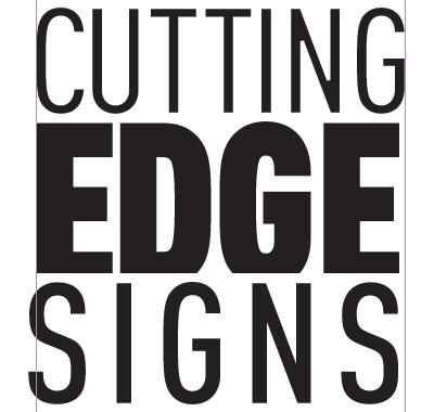
why do i feel this isn't done. feel free to flame meh.

- traut0
not so cutting edge.
nice clean type though.
- tymeframe0
It's for a vinyl signage start up thing
- PonyBoy0
feels mom & pop "I had my nephew do this... isn't it greeeat?"-ish....
... start-ups don't have to feel like start-ups...
kernings stinks... margins are... odd... nothing really lines up... you hacked of an edge of 'edge'... that's probably the first thing you see in a DIY design book... nothing original about that...
:( sorry s'not so positve
- univers0
My initial response is that there isn't enough contrast, I think this could aid to the idea that it doesn't feel finished. It feels gray and the style choices don't feel committed. As for me I have to dive into my informational design books, and if I think up some solutions you can try I will shoot them here.
- ********0
any logo with a company name that includes "cutting edge" is just going to look like shit. i hate cliché names like that.
- it's like.. REALLY? are you REALLy "cutting edge"?! how un-cutting edge.********
- Green Thumb Landscaping.********
- Cutting Edge Landscaping. lol.********
- cutting edge...a.k.a. they CUT vinyl. ok, a bit cheesy but come on...tymeframe
- eh. i guess there's a connection. but not obvious enough.********
- it's like.. REALLY? are you REALLy "cutting edge"?! how un-cutting edge.
- univers0
Hehe look what I found.
- ********0
pony, your boy needs a cutting edge...

- PonyBoy0
and then there's this gem:

- tymeframe0
I think you guys are a bit caught up in the name....not the logo. any other feedback?
- ********0

- just use this..posterize is the new glossy button********
- edg designe?detritus
- just use this..posterize is the new glossy button
- PonyBoy0
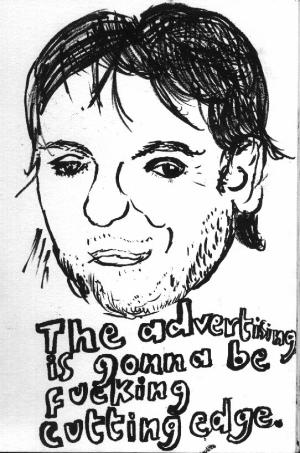
i made this for you:

<3 <3 <3 <3 <3 <3
- _salisae_0
Your type needs work. Look at other logos done strictly with type and notice the differences. We can't feedback a good eye for typography into you unfortunately.
- +1akrokdesign
- -1. back to where you started.********
- sorry. i'll go to bed now..********
- hah.akrokdesign
- ukit0
I thought pony boy's typography did the trick
- univers0
ponyboy should enter that logo into the Photoshop wars! WoW Brilliant.
- ETM0
- bulletfactory0
let's see some of the other directions you took this.