The New Ugly
- Started
- Last post
- 27 Responses
- rxphoto
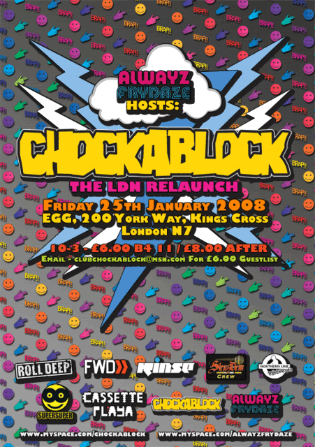
032c, Super Super, Neville Brody, Mike Meiré, Steve Slocombe, New Rave
http://www.sad-blog.com/?p=1037
"I can abide almost all if of it except the stretched typography". –Michael Beirut
- Llyod0
well art follows politics
- sikma0
interesting read. nice blog.
*leans back in chair. nods.
- ukit0
Ugly logos are in too
London Olympics, Animal Planet etc.
- ukit0
I can't wait until I get to hear this from clients
I like where you're taking this, but can you make it uglier?
It's a good start, but can you make it look a little but more shitty?
- JKilla770
I remember my buddy last year bitching about how his creative lead would always say "Could you make it more new rave" when ever he present mock ups.
- ukit0
Sorry guys you can't resist the future

- ukit0

- ukit0

- ukit0

- Jnr_Madison0
Big brands already fighting it out...

- 1pxsolid0
Super Super rocks.... have had a browse through the magazine. Shabba-static
- ********0
yep i can see that style making the rounds again, its due
- TheBlueOne0
So basically these guys are surrendering and saying that 13 year olds with MySpace pages and their animated gifs and giant background images are the cutting edge of design? Heh. Go figure.
- rxphoto0
Older thread on 032c here:
http://www.designobserver.com/ar…link to Rawsthorn article:
http://www.nytimes.com/indexes/2…