Bit by a Mouse
- Started
- Last post
- 17 Responses
- Ampersanderson

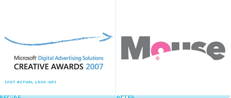
I would have to agree with Armin Vit when he says that "I love it."Created by
www.johnsonbanks.co.uk
www.brandguardians.com
- Ampersanderson0
Really via underconsideration.com/brandnew/
- robotron3k0
oh so British...
- utopian0
Overall it is very nice.
However the © looks bizarre and is a distraction below the "o".
And I do not feel that the overall curved shape/knockout is 100% aesthetically proportioned, it is to enlonged and stretched out..
- Spookytim0
Twiddly wank. Look at it again once the novelty wears off (third viewing)... its ungainly. Visual co-ordination has been sacrificed for the sake of a laboured pun. A competition winner for a promising student.
- Ampersanderson0
Maybe you like the first iteration better?
- dbloc0
I like this new logo
- i_monk0
It looks like the mouse is being crushed flat. They could have gone more playful/energetic, for sure.
- Spookytim0
I would warm to something more like this...

Obviously I've spent about .2 seconds on it, and haven;t even selected a decent typeface, but the mouse is cute, more mouse-like, small like a mouse should be and positioned as a mouse would be. This allows the mouse to operate separately from the (eventual) wordmark and can be used in interesting placements up the side of things, sneaking behind things, always very very small, like a tiny little gold mark.
- horton0
mouse is an ok concept, but poorly executed.
- Spookytim0
Side Note... Looks extra bad when condensed to fit QBN of course!!!
( My side-noite facility is not working. p q )
- Ampersanderson0
Spooky, I guess I read the first one not simply as a literal mouse, but as a technological asset to the computer. Logos aren't always literal. In this case it's vital to understand the use of the logo—the entity which it represents: a Digital Advertising Awards program. It also isn't always seen in the context in which you're viewing it now (online) but within typographical environments. Because of that, it needs to be readable. I hear you on your version; it makes sense and i even like it. But i think the actual logo fits within the entire campaign beautifully, whereas the mouse in your version would be almost entirely illegible.
- Spookytim0
Fair enough Ampersanderson. I just felt I ought to put my money where my mouth was after being so negative about the actual logo, so I quickly whipped that cheeky fella up in order to avoid the (probably much deserved) cry of "we'd like to see you do better you silly twat".
I visually think the actual logo is really stale looking and it reminds me of dodgy hair care product branding from the mid 80's for some reason.
I appreciate that the logo doesn't need to be literal, but I would argue that their intention and mine are equally to evoke the idea of 'a mouse'... I didn't do my little two second effort with a blank sheet, I sought to illustrate the same literal concept as they have, but in a more attractive way. Given a blank sheet I may not have decided to be literal with my mark making at all.
Not bad for a quicky though eh. It was nice to get back to some logo design even if it was totally spurious and for no real purpose!
- non0
The concept is clever (mouse & lion), but the execution of the logo itself doesn't quite do it for me. I really think that its application takes it to an other level though.

- chossy0
The 'e' at the end should have been the tail of the mouse. I'm brilliant for saying that b d