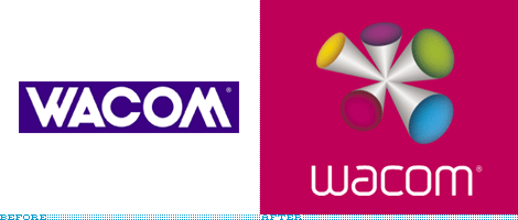
New Wacom Logo
- Started
- Last post
- 60 Responses
- F_18
http://www.underconsideration.co…
Typography = yes
Weird ass image = no
- MrD0
wtf????
- F_180
it would have been so much more effective if they just left it as type. i actually like the new typeface. but seriously, what the hell is that image?
- ********0
Yea that new type in the blue box would have been perfect. Im down with weird shit if it looks nicei, but that thing is just ugly
- CALLES0
those two logos dont take advantage of owning a tablet at all
- lbfolio0
I though it looked bad, but then I saw it animate - and realised just how bad it was!
See it in all it's painfull glory: http://global.wacom.com/
Ouch!
- MrD0
o man
thats just painful
sadly thats the caliber of something that i would design
- StratusGD0
What F_18 said.
What I find really surprising? That QVC logo is pretty tasteful.
- billl0
blech
- akoni0
shikes
- harlequino0
too much "clown"
- kewHexton0
It won't stop floating linearly and chiming at me!!
- version30
i really like the qvc logo, there's some nice animation done on the tele
- ********0

- flashbender0
shocked that came from the same minds as London 2012.
- ********0
"shocked that came from the same minds as London 2012."
i see...
- k0na_an0k0
looks like a bunch of qberts in an orgy.
sfw
- menos0
nasty.
- menos0
...hmmmm...another Wolff Olins release, wow those guys just keep on giving!
- horton0
Typography = yes
Weird ass image = no
F_18
(Oct 1 07, 09:07)the new type is horribly trendy imho.. its gonna look dated in no time.
actually.. already looks dated.