Crit... quick logo
- Started
- Last post
- 50 Responses
- Nairn0
imo, you need to somehow extract the bastard child essence from Terry Jones and Tim Robbins..
- tikal2k0
your design is a bit "mr. peanut wears a different hat"
i would combine Bluejam's photo with this:

and turn it into a logo.don't forget the glow and the dropshadows!
- chossy0
oh dear :'( you should batter the person that said that rusty (even though they are correct)
- ********0
it doesn't look shit enough. and by what means does it have to look shitty? why does it have the web2.0 button look? Looks like you didn't put any effort in it at all. Even if it has to look shitty in a tongue in cheek kind of way you have failed.
It's mediocre at best, and that's the worst you could ever do.
- ********0
Like i said, there isn't enough raping and pillaging in that logo.
- Point50
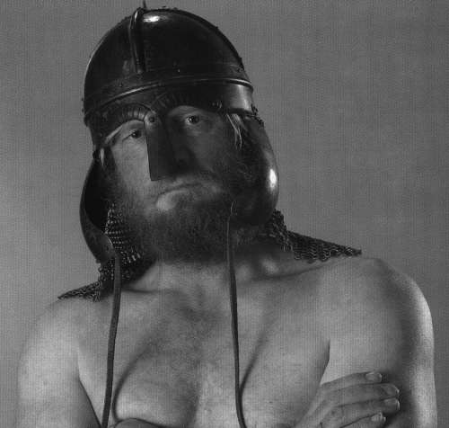
The Blind Viking
- Ampersanderson0
i wonder if this guy would like your logo?
- dbloc0
looks too much like this logo...

- Pixter0
I'd drop the drop shadow and set the text outlines to black. The text could be a little bigger, the way it is maybe get illegible at small sizes
- Llyod0
are those eyes or nostrils?
- Pixter0
And it definitely can't have a web 2.0 look, vikings are suppose to be web 0.13
- dkmb0
more cowbell?
- jysta0
As said before, run the text around the bottom of the circle and then do a distort perspective very slightly and tilt the logo. ( So that the bottom part is closer then the top).
Also needs more HORN!!!
Anyone remember Crossbows and Catapults? Wicked game, do a logo like those things you used to lob.
- npduggins0
that is appallingly sh*te you should be ashamed to call yourself a designer
- ********0
Still needs more raping and pillaging in it....
- ian0
And cowbell.
- Ampersanderson0
let's definitely keep this thread alive.
- ian0
Agreed. I like this thread.
Regards to the logo, can you possibly jazz it up by about 15%?
- mbradyclark0
jazz factor needs to be turned up by 75%.
- ********0
raping and pillaging by atleast 75% as well.