Bcard Redesign part 2 (the real one)
- Started
- Last post
- 31 Responses
- Andys810
Nice phatlee cheers for the help
- indian_pole0
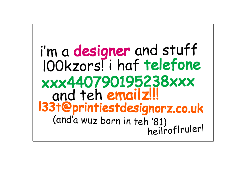
i like it (kinda).. but it's a little contrived..
it looks like its geared towards designers as a kind of 'anti-design' statement - i.e. look at me i dont need fancy graphics!, i'm sure you've seen similar stuff in design mags (which isnt necessarily a bad thing).
depends what kind of clients you want to approach, i think it works if you're looking to use it to get freelance work with agencies as opposed to corporate work.
kind of agree with letters, if you're gonna be that simple, the copy needs to be outstanding.
- paraselene0
LOVE it.
- phatlee0
concep3.com/dump/busin... [gif]
Nairn
(Mar 9 07, 03:38)Hahaha... thats actually pretty cool!!!
- Nairn0
:)
Imagine it with a full-colour kitten print on reverse...
- Andys810
Yea real nice well done!
- kelpie0
"born in 81"
2007 - 1981 = 26
showing your age there bud, I wouldn't expect that of anyone over the age of 24 ;)
- Andys810
Wrong 25, was only jestin come on its a friday!
- ********0
i dont really see that much change from ur original one!
like some one said before the COPY that goes on these cards are critical to their success.
it needs to have something about it that gives it some spark. maybe a subtle typographic twist, a subtle play on words, the emphasis on a certain word - something..
the typeface/finish etc are secondary to that. although it looks slightly too designed for someone thats going for the anti-design bc. (maybe a default-looking font (but with a Vsubtle designer feel)- ie futura, frutiger, courier, courier sans)