NYC MTA Font
- Started
- Last post
- 30 Responses
- tenpointtwo
I know this has probably been asked, but do you guys know what font the MTA uses for their signage, etc?
Thanks in advance
- mpfree0
Look like Akzidenz Grotesk to me, but I'm probably wrong
- acescence0
Look like Akzidenz Grotesk to me, but I'm probably wrong
mpfree
(Jan 4 07, 14:34)you are correct sir
- acescence0
i mean about the font, not about being wrong, ha!
- mpfree0
ha good guess I guess..
http://www.creativepro.com/story…interesting read...
New York subway lines are now designated with single letters or numbers. The signage uses a version of Aksidenz Grotesk, a precursor to Helvetica.
- ********0
neue helvetica 85 black?
- ********0
too late
- ********0
and wrong anyway...
- mpfree0
doesn't Newstoday also use AG?
take a gander up at the left hand corner homeboy
;)
- tenpointtwo0
thanks fellas
- Typographica0
The font at the time Vignelli designed it was called Standard Series. I'm told Linotype's Basic Commercial is a closer interpretation of Standard than AG.
- johndiggity0
the typeface in that picture linked is no doubt helvetica. i'd bet the farm on it. they may have used basic commercial or standard in the past, but it appears signage is now done in helvetica and franklin gothic on the saftey signs in the cars.
- version30
according to

and
http://whatthefont.com/
the font in question is
http://www.myfonts.com/fonts/efs…helvetica and AG weren't even given as options
- Typographica0
Nice find, v4.
I think diggity could be right for more recently made signs.
As for the older stuff, someone find a Q and that should settle which current digital font is closest.
- Typographica0
Qs:
Helvetica
http://www.fontshop.com/index.cf…Helvetica Neue
http://www.fontshop.com/index.cf…Akzidenz Grotesk
http://www.myfonts.com/fonts/ber…Basic Commercial
http://www.fontshop.com/index.cf…Europa Grotesk
http://www.myfonts.com/fonts/efs…
- Typographica0
By the way, I believe Europa Grotesk SH is simply Scangraphic's version of Helvetica with tighter letterspacing.
- Typographica0
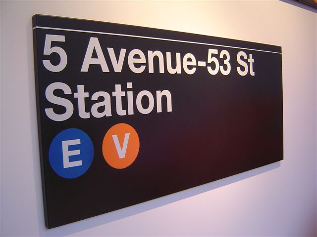
The Q shown in the subway image at the bottom of this page appears to be from the older signage and closer to the Qs from AG and Basic Commercial. (Tail does not cross round stroke.)
So my conclusion is:
If you want to match newer signage, go with Helv.
If you want to match the original stuff, go with AG or Basic Commercial.
- Typographica0
Oops. Forgot the link:
http://www.subwaynut.com/brochur…How many posts in a row = spamming?
- Typographica0
One more and then I'm done for today.
Old Sign

Basic Commercial Black
http://www.fontshop.com/index.cf…Not a match, but close as you'll get with a digital font.
Newer Sign

Helvetica Bold
http://www.fontshop.com/index.cf…Again, not a match, but much closer. What troubles me much is the damn tail on the 'a'.
- mpfree0
http://www.creativepro.com/story…
New York subway lines are now designated with single letters or numbers. The signage uses a version of Aksidenz Grotesk, a precursor to Helvetica.
-
are they wrong?
- johndiggity0
http://www.fontshop.com/index.cf…
i think this is a match. it might appear heavier because it's knocking out, but it explains the tails on the a's.
they really need to get their shit together. the guy who wrote that style guide must be close to suicide after seeing all this.