Poster Critique
- Started
- Last post
- 22 Responses
- 3RR0R_404
Hey guys,
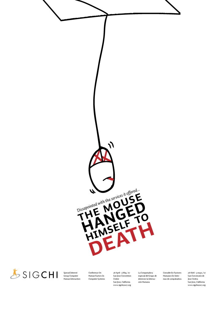
this is going to be a 20x30 inch poster.
What do u guys think?
Do u get the concept?
Any suggestions?Thanks :)
- mayo0
Is the typo and grammer oopsie on purpose? Otherwise, i wouldn't mind seeing the "D" line up with the "The.'
Fun concept. What's it for?
- 3RR0R_4040
oh boy, im so sleep rite now i totally missed the typo/grammer... point me out any grammatical/typo mistakes please...
and yes, the 'D' should lineup with "The"...
It is for my communication design class... im doing a poster on Conference on Human Computer Interaction.
glad to hear that u got the concept on the first go... :)
- mayo0
:P sorry, i'm still in weekend mode
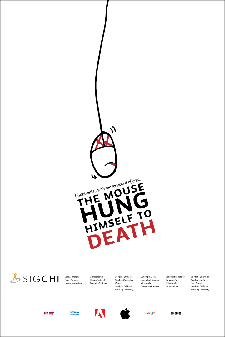
"Disappointed" and the mouse HUNG himself.
- 3RR0R_4040
good call Mayo :) im glad i bumped into you or else i wudve made an ass of myself in class tommorow
- 3rr0r-4040
bumpDEbump
- Soler0
i like the illustration, but the typography needs work
- ********0
nice but lose the shape at the top. completely superfluous. ogilvy disapproves of that shape.
- 3rr0r-4040
hehe, i was thinking of leaving the shape at the top out too... since it doesnt have any purpose..
Soler, any particular suggestions on the typography?
- effort0
I think "hanged" might actually be right... see:
http://www.google.com/search?hs=…
although i'm not sure if the "to death" parg at the end chnages that.
without "to death" i know for a fact that hanged is correct... i.e. The mouse hanged himself.
poster is very nice!
- ********0
A for effort! ^
- blastofv0
cool idea, but does it need the line at all? why not let the illustration carry the poster? it's almost like you've added the line to explain the concept in case people don't get it. I say make the illustration the star and support it with a bit of less-prominent type at the bottom if necessary. just a thought
- ********0
btw. any adman would know that it is not really good for the brand to have the word DEATH as prominent as it is in your poster.
not good. not good.
- 3rr0r-4040
hehe.. i agree crouwel..
but u gotta be a little bit out of the box, rite?im all for dark humour... and this event is basically a nerd-fest... gotta add some spice to it.
- JerseyRaindog0
Agree with Crouwel - lose the 'table' at the top - unecessary. Not sure about the line at all. Maybe you should aska question so the reader demands a response. Summat simple like; "Is the mouse dead?" Not on angel though. The type demands simplicity with your idea. Something big and bold.
Also make the mouse cable straight to give the mouse weight and tension - it wouldn't hang like that.
Otherwise nice.
- JerseyRaindog0
Angel = angle.
- 3rr0r-4040
another thing my friends pointed out was that the body-copy is in english and spanish... but the headline is just in english...
if i made another with headline in spanish and body in english and spanish, wud it be okay?
- kyl30
A WELL HUNG MOUSE IS ALL YOU REALLY NEED
- ********0
ha
- 3rr0r-4040
since the event the poster is for attracts a lot of "non-creative" people, i think having the text describing what is happenning wud help... eh?
im uploaded a new version:
funny thing is that the project is due in 3 hours hehe :) ive to still print it out, mount it... write a rationale... normal design school bullshit
- 3rr0r-4040
from "non-creative", i meant "non-visual"