Monogram crit please
- Started
- Last post
- 30 Responses
- jevad0
nice work mate - I like the left one too
- gramme0
Thanks all for the input. I tweaked the 'p' to look more natural:

- ********0
Sweet! Really makes a world of difference.
- ********0
I think the letter forms are a little heavy.
You're right about the brown and the light green though. Should look very nice.
- lherb0
Looks great, good luck and congrats.
- Fariska0
the one on the right, cause the first reminds me this brand:
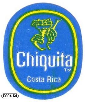
- gramme0
the one on the right, cause the first reminds me this brand:
digilander.libero.it/B... [jpg]
Fariska
(Jul 14 06, 08:04)um
Just b/c there's an oval? check the newest link, that oval is more geometric. I agree w/ everyone, the one on on the right doesn't work so well with all that scrolling. Makes me wanna put on a cravate and eat a croissanwich.
- Fariska0
the last version with the oval looks fine. No more bananas, don't worry :-)
- inky0
the on outside the circle..its classier......condier this my RSVP:its me and a guest.....congrats!
HA
- lherb0
Would also look good wrapped around a cigar!!!