Poster crit
- Started
- Last post
- 21 Responses
- ********0

- ********0
Shouldn't you have posted this in the BBQ Thread?
- kelpie0
looks nice, but how far away do you want people to read it from? do you think red on yellow will carry once its printed? and should the info be bigger? are you making too much of the image and not the content?
(just asking some of the questions I've had to answer in the past)
- tommyo0
Seems like you're off to a good start, I think it just needs some polish. Your reds seem off on the crossed out eye and the dripping neck. You could maybe try incorporating the title ontop of the plate (enlarged). I think that might bring a little more interest to the piece. Your title could also maybe be done in a different font, or hand drawn might be nice...make it stand out a bit. Cheers!
- PonyBoy0
Enter response:
more cowbell?
- JesterFX0
laziest link ever ;)
- k0na_an0k0
Not bad. If the yellow and red colors are symbolic representations of McDonalds I suppose I'd like it even more.
The red on the cow isn't the same red as in the title and it's bugging me a bit.
Pretty nice though.
- johndiggity0
there's no sense of heirarchy, mainly the relationship between the type and image. contrast between the yellow and red, and the white and yellow, and the thin black lines on the white plate need to be reevaluated.
typograhically, the way the information has been presented doesn't seem to give any sense of what's important save for it's vertical placement on the page. the slant of the bottom 2 columns, as well as the addition of the website on a path are awkwardly handled and unrelated to the rest of the composition.
i'd rethink a lot of what's going on in this one.
- PonyBoy0
Enter response:
too much red (if I can be serious a moment)...
the litle type in red (under the circle) - make it white... subtle... who cares what it says...
.... and the cross in the eye - make it black... so the blood in the neck is deadly annoying..
... you're drawing attention away from that - and it's clever enough that you should probably just pronounce that and tone down everything else...
- jobhall0
thank you all! very good advice. the poster i put up was just my first rough and the changes you suggested really help.
thank you!
- ********0
Shouldn't you have posted this in the BBQ Thread?
flavorful_4
(Apr 24 06, 07:22)hahahaa
- Seanbot0
i like the coloring, but my eye gets lost. the visual hierarchy is weak.
- madirish0
dude, are you doing this for sustainabletable.org? if so, things are about to get too close for comfort...
- garett_west0
//cool, i love posters that tell me how and what i should and shouldn't be eating to live.
do you smoke?
- Bluejam0
having just visited ... http://www.sustainabletablemovie… i don't think the poster is working at all. Looks like it's advertising a different film altogther plus a cow with bloody throat seems a bit oldhat.
imo
- tommyo0
dude, are you doing this for sustainabletable.org ? if so, things are about to get too close for comfort...
madirish
(Apr 24 06, 08:01)uh oh! do tell! I want some Monday morning gossip.
- madirish0
haha
inderectly, they are a very large client of mine and i supply creative for a lot of thier projects, indirectly. not that the design community isn't already pretty tight, this woudl just be a weird coincidence to see here on the monday morning PVN.
- jobhall0
madirish,
it is for a different client. not sustainabletable.org
- madirish0
cool, job. it would have just been funny if it were the other way.
good luck with the project. oh, and send garrett a free ticket to the premier.... perfume scented. ;)
- drummer0
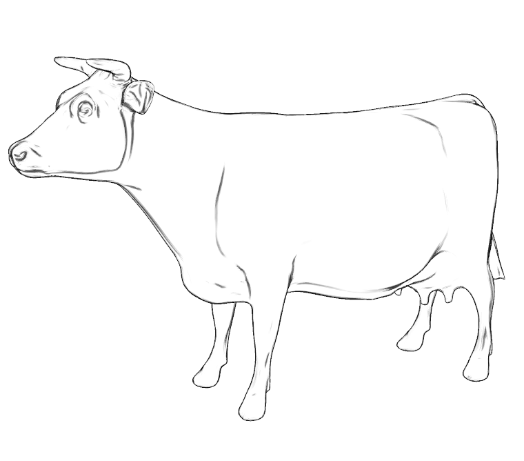
You may want to tweak or draw your own cow. Not that the original creator of the image will ever see the poster, but, you know.