Id like some advice please :)
- Started
- Last post
- 11 Responses
- Louno
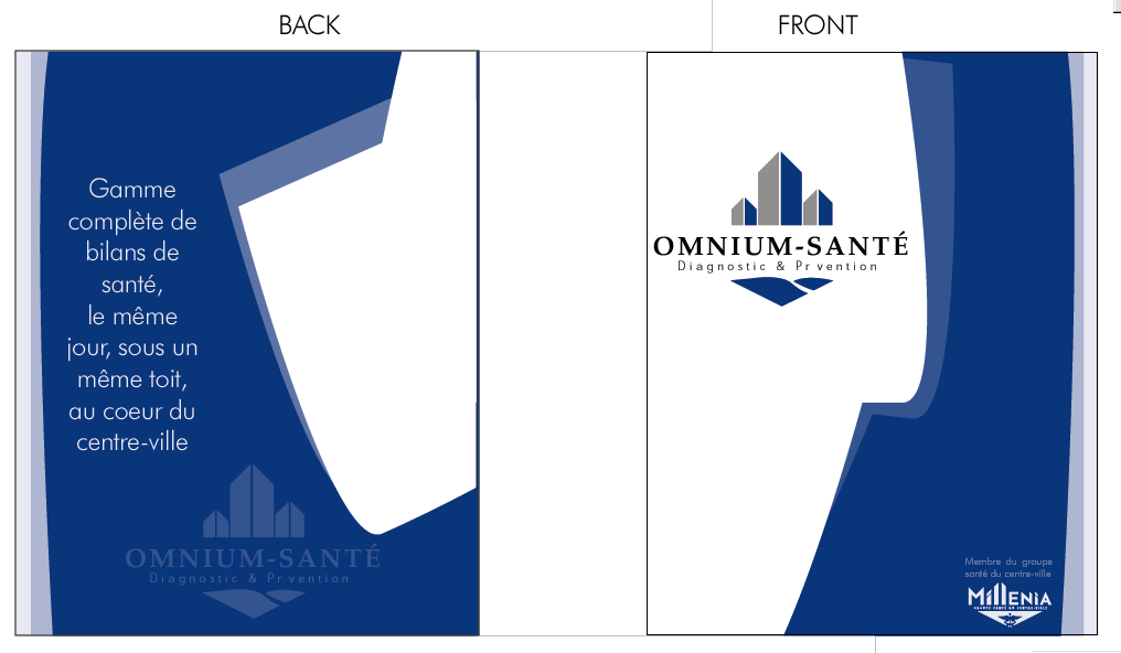
This is a cover for a publicity package for a private medical center...
I dont know i find it so-so , just need some crit, or advice ... maybe that would help :)thanks , greatly appreciated
- k770
lose the white on the back. make it solid naby, iwth just a smidgen of the lite blue. BAM!
- k770
make the graphics on the back smaller then on the front. i confuse which is which. the back should be nondescript in my opinion.
- Bio0
nice layout. my initial thoughts:
shrink the OMNIUM-SANTE logo on the front to give some room on the left edge. maybe half an inch?i think that a VERY light texture in the white space would really make the whole thing come together and give it a feeling of dimension. something so small can really make a huge difference. as if the white area were really behind the blue overlapping pieces.
same on the back and the front.you've got a nice font on the back cover, but it really doesnt do it for me. (chalk that up to personal preference if you like though) but i would try a simple serif font. i like how it is a very light font though. somethng matching that feel in serif would be my pick.
here's another you can chalk up to personal preference if you like, but the logo on the back really doesnt look like it needs to be centered. and it gives the right hand side of the bottom a pinched look. it might look nice if it was centered from the edge of the blue on the left with the area where the white comes down on the right. sort of centering it on the left 2/3rds of the page. (did that make any sense?)
i really like those shapes though. they make a great playground for type and logos.
anyway, those are just some quick thoughts. lookin good man!
- Louno0
I might need the white space to put the picture of the President of the company + a few words from him and a signature..., he wants his pic on it , i said it wasnt a good ideal... so i dont know yet...
I was thinking of using some Silver Ink for the grey on the logo and for the white logo on the front page ... not sure how to explain this in english , and maybe use some thick paper, matte ....
- Louno0
Woah thanks bio , ill try to check these things out , just one thing tho , about the texture, if i do put a texture , this means im going to have to print this in CMYK right?
Is it going to be very noticable ?
Anyways im going to have to print it in CMYK if i have to put the picture of the president on the back grrrr... but i think i convinced him not to put it yet...
- Bio0
doesnt have to be full color at all really. you could do it all in grey and have it look quite nice.
i just made this texture up for a series im workin on for Oakley.
http://www.lifeinsepia.com/nt/lo…
(PS 10)just happened to be working on the oakley stuff as i checked your post, so it was on my mind.
if you like it, feel free to use it whenever. if not. . . just a thought anyway. =)
- Bio0
eek. now that i see it without the graphics on it, you can tell where i mirrored it. might wanna stamp that out. hehehe.
- brundlefly0
yeah the logo on the front is pinching the edge, shrinking will make do....and the copy on the back. rethink the font, or at least its size....
perhaps a serif, do not fear the serif.
other than that nice work so far!
- Louno0
Cool thanks for the texture, im not sure it would fit right with that prestigious health care center cuz it has that dirty look, but i get the ideal , i could use a close up of some medical instrument , real light tho , light grey... or some bluprint of the center, for some reason they seam pretty proud of their bluprint , they build the whole center from scratch and they keep a large blueprint on the wall ... might ask for a scan... you have a link to the stuff ure working on for oakley ? :P
- Bio0
all good louno. that blueprint or medical tool sounds like it would be great for giving it some depth. a nice light background.cool.
as for the oakley stuff, i've still got some work to do on my type, but here is the first draft of the poster and a letter size sign:

and
they both need some more time in them, but i gotta get some more junk out today before i can crank em back up. (ouch. i can already see the glow around the type is a little too harsh. . . hmm.)i am open to suggestions if you feel like offering your thoughts. =)
- Louno0
Hey bio sorry i didnt answer yesterday i left work early , anyways , I like the first one pretty much , the second one tho isnt as good , im not sure why, but for sure i dont think the straight line help , and u were right about the blur , althouth it doesnt show much . So anyways i think the feel is right .
Of course all this is IMHO . see ya