< 11 designer
- Started
- Last post
- 52 Responses
- ********0
Baur it is, not Bauer. sorry.
- tomkat0
#2 looks a lot like that presstube nike commercial to me.. but it's very sweet.
i also think 9 could take the cake.
- unfittoprint0
9. definately 9.
- ********0
- celluz0
9 is quite good but the rest is disappointing...
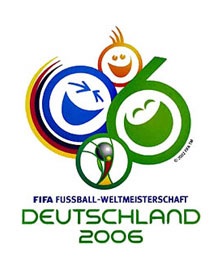
have you guys seen the official logo?
please sit down before watching
- tomkat0
yeah i've seen that .. quite a shame for german design.. oh boy.. where do i live?
- bug0
yer joking right...
- ********0
that is really the official logo?
i really thought that was just some kind of joke, i have seen it on here before.
i can't believe this is real.
- koko0
wooooaaaaaa
What a shame. I think most of the logos are way out. Think about what you are representing: "the world cup",...soccer, fútbol...
not laughing clowns:P
Number 9 is the only one that makes it for me. It is modern, kind of rough, trying to go with times but still representing thw idea.Still in shock
- ********0
yes, the logo is a joke. literally.
- drzoom0
yes .... that's it - and they won't change it anymore :(
well at least it can compete with london's olympic logo ...
- ********0
http://pub103.ezboard.com/fsocce…
and it is all their fault:
http://www.abold.de/
- drzoom0
also why, or better how can they use an element from the previous world cup logo

... oh yes, they've changed the colours slightly and added a gradient!
- lowimpakt0
is there boredom leading to frustration, or something??
have an NT worldcup logo comp and see what comes out of that.
- ********0
lowimpakt, i don't know what you mean with that statement.
but i think discussing these matters is very important.
we could do it though..
although i would say making a close-to-perfect logo may take quite some research and valuable time and i don't know if that is a viable idea.
- drzoom0
>>although i would say making a close-to-perfect logo may take quite some research and valuable time and i don't know if that is a viable idea.
...I think that's the reason why some of the alternatives at 11 Designer are not that good either.
- lowimpakt0
I found the reaction strangely heavy for what was on show. I may have a different weight on the importance of the World cup and what they may be trying to say and who they may trying to reach out to. By the NT comp I wanted to see how others felt it should be represented.
- lowimpakt0
also I find the critiques of logos to be very vague and generally only reflect the fact that the person would have done it differently themselves.(i.e. not really a crit)
- ********0
"I may have a different weight on the importance of the World cup and what they may be trying to say and who they may trying to reach out to. "
could you elaborate?
it sounds like the weight that you are talking about is a personal one, and i don't think it is. but then i may have misunderstood...
- lowimpakt0
well
"but i really do not think it is very suitable/strong enough for a World Cup logo."I may have a different view on what is suitable or if strength is the key to its identity. FIFA seem to go on a lot about inclusion, fairness, youth etc....