Logo of the Day
Out of context: Reply #840
- Started
- Last post
- 934 Responses
- sarahfailin12
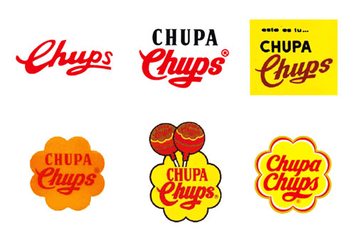
Salvador Dalí designed the Chupa Chups logo:

The Spanish surrealist artist was asked to design the logo by the company's founder, Enric Bernat, after Bernat complained about the existing logo to Dalí over coffee.
Dalí sketched his design on a napkin in about an hour. He incorporated the company's name into a brightly colored daisy shape, and suggested moving the logo from the side of the wrapper to the top. He also insisted on using the company's recognizable script in all red.
The logo's daisy shape aligns with the brand's cheerful personality. The logo's slogan, "Es redondo y dura mucho, Chupa Chups", translates from Spanish as "It's round and long-lasting".
The logo has remained virtually unchanged, though the red text is now entirely cursive, and its flower is ringed with a matching hue. The logo has been featured in pop culture collaborations, including with Russian astronauts and the Italian swimwear brand Tezenis.
- every logo designer knows this, also paula scher drawing the citi logo and the nike logo story********
- It was based on his mustache in the morning.AQUTE
- Not everyone is a logo designermonospaced
- https://i.imgur.com/…utopian
- To paraphrasing an old professor: "Not only was Dali a violent sex pest with a pathological fear of vaginas, he was also a fascist that designed a sucker logo."garbage
- Nice bit of text that!robthelad
- every logo designer knows this, also paula scher drawing the citi logo and the nike logo story