blog
blog
Out of context: Reply #75540
- Started
- Last post
- 76,804 Responses
- stewart21
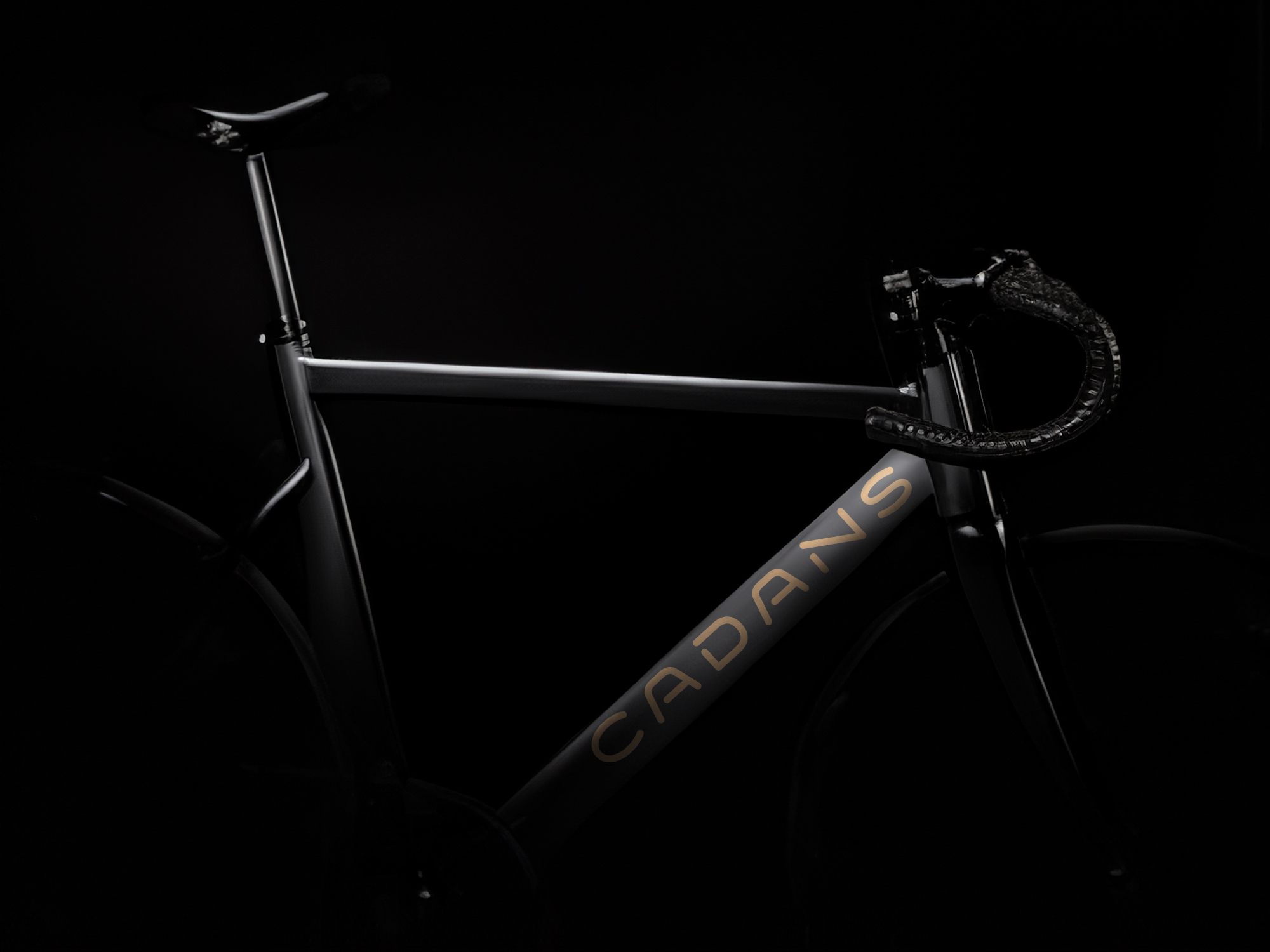
Working on an idea for a new typeface. Maybe uppercase only.

- Ooooooh that's lovely.Continuity
- Lovely. Please finish this, so I that can update my brand :)Nairn
- Love it AND you had me @ cycling.ideaist
- Yep awesome and loving it.********
- Very nice! I would reduced the font size in "CYCLING", there is something visually uneasy with the "NG" sitting below the "NS".utopian
- This type was made for bike frames, 100%garbage
- Maybe widen the space in the D a bit to be consistent with open space in the Asrhadden
- Working on it to make it consistent. Thinking of making it outline and variable on the weight axis.stewart
- Nice work sir, that flat-top A is ace. How do you select the letters to break? That’s probably a dumb question.MrT
- Thanks MrT. Letters to break, what do you mean exactly?stewart
- Cyclists are gay********
- Where do you get your ideas from?palimpsest
- Have you tried it with flat terminals?garbage
- Good one garbage, I'll try that.stewart
- I meant which get the A, N, Y treatment - with a stencil-like break in the character.MrT
- MrT, may be an open type option so the user can choose open/closed characters.stewart