Logo of the Day
Logo of the Day
Out of context: Reply #501
- Started
- Last post
- 934 Responses
- milfhunter6
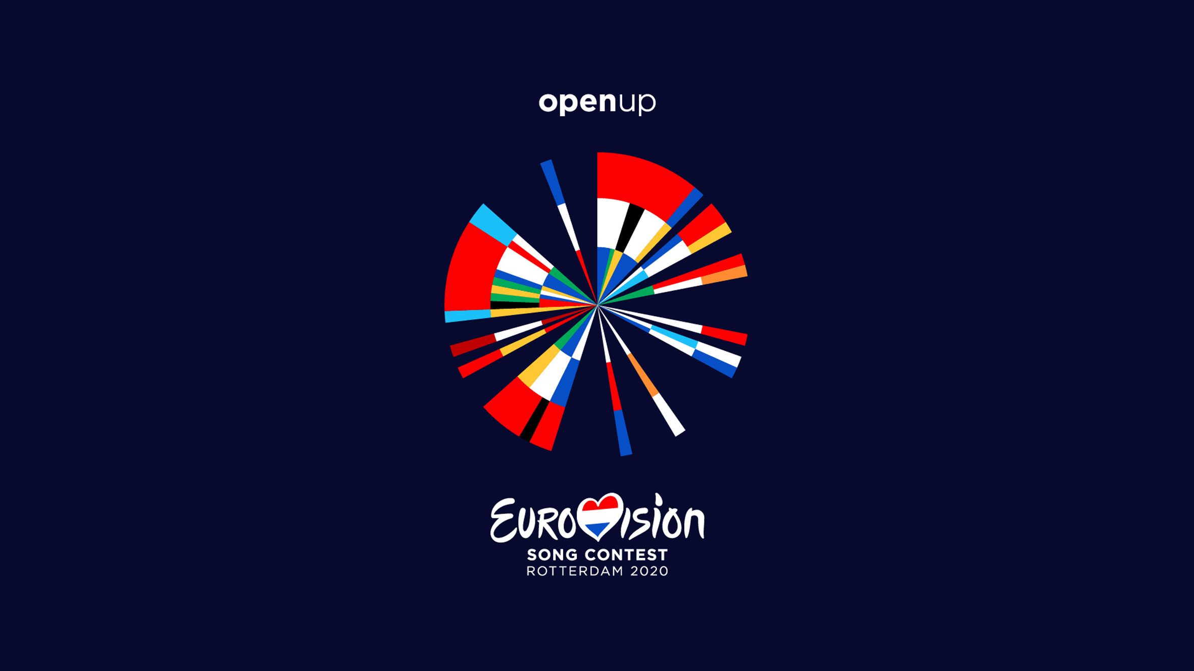
- I don't get it. It's flags in a circle right? But why?robthelad
- @robthelad
https://static.dezee…milfhunter - The flag circle? Not really a logo. But I like it. Countries that have won more get a biggest slice?thumb_screws
- i like it!renderedred
- it reminds me of the old logo: https://i.pinimg.com…renderedred
- I like it !spl33nidoru
- Very nice dude. As a Brit I resent the Eurovision obvs but this is nice work none the less.Hayzilla
- What part of it did you do and how many more people worked on it?NBQ00
- Why, as a Brit, do you obviously resent the contest, Hayzilla? Asking as someone who has never watched it... .Nairn
- The old logo looks like contemporary design.sinjun
- @renderedred nice! yeah we took that as inspiration for the background. not included in the current design https://static.dezee…milfhunter
- NBQ00 did the the concept and visual part more or less with 1 other designer but a bunch of other people worked on it as well. Was a team effortmilfhunter
- why is Slovakia missing?kap0r
- Estonian flag colours are in the wrong order, but I haven’t check other ones to see if it’s intentional. Lovely otherwise.scruffics
- Very nice. I like the collaterals too.
The only part I hate though, is the Eurovision logo that ruins it. Why a Pepsi logo inside the heart?nbq - Cool direction but I can’t help feel it could be simplified drastically.monospaced
- Even just removing the numerous duplicates would help in that. You might end up with a mark that was but a fraction of the slices in the pie.monospaced
- And when you append the Eurovision logo right in the center of this logo it gets quite busy. Couldn’t you just typeset Eurovision?monospaced
- is openup a third logo in this collage?monospaced
- BTW Milf. Looking at your agencies site. I get the home text overlaying on every page! Mac/Chrome.
https://i.imgur.com/…Hayzilla - Is there a BW version of the logo?desmo
- @Nairn I'm a Brit who also thinks Eurovision is a load of tripe. Not sure of a broader reason. That aside, I like the logo and give it 12 points.MrT
- @hazyzilla, i know. that text effect is horrible..milfhunter
- @MrT haha thanks!milfhunter
- haha, +1 MrT :)Nairn
- Great work. The executions and presentation on the link are even better.CyBrainX