Punches For:
Punches For:
Out of context: Reply #1422
- Started
- Last post
- 3,486 Responses
- sr_rosa0
- what's the problem?********
- No prob, just punchessr_rosa
- why?********
- Yes, why? Why!?sr_rosa
- You have no reasonable answer, do you...********
- I think it's obnoxiously pretentious bullshit, and the examples are both aesthetically horrid and technically awful for people like Interbrandsr_rosa
- But no reasonable answer whatsoeversr_rosa
- Ah, now you want to discuss like an adult, cool...********
- I think they look ok, and makes a good point about the useless shit we waste countless money and resources on********
- What exactly about it is pretentious?********
- No, I don't want to discuss, and less act as an adult. Just trying to be polite, as you kept asking. But this makes no sense.sr_rosa
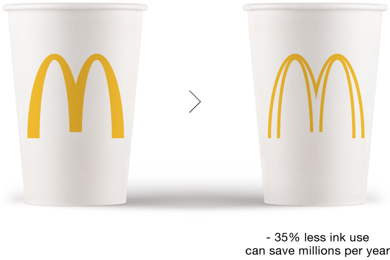
- Jeopardising a well stablished brand for saving ink? What a joke. Energy use — ie. transportation — is far more important.sr_rosa
- Even down to ink, you can make the logo smaller instead of adding ugly blank spaces. Unless you are Apple, and crazy about notches.sr_rosa
- It's just a thought provoking design exercise. I suggest a shower head to the vagina to get the sand out********
- yeah but white pixels use up more energy than color so in reality they are wasting way more in electricity consumption fucktards. :)_niko
- no to all of these.imbecile
- lol niko********
- ‘Thought provoking design exercise’ is far more obnoxiously pretentious than anything in that site, I'll give you that.sr_rosa
- Wash the sand out of your little vagina and get on with your life...********
- So, you are the one insisting to discuss it, and I'm the one who needs a life?sr_rosa
- If you are one of the people responsible for the site, take the punch and go on with your life.
If not, keep walking.sr_rosa - Cunt.********
- Very mature.sr_rosa
- No you're a very mature********
- manureimbecile
- i like this idea. screw you lol********
- it IS just a thought provoking design exercise, nothing more, and saying that is as far from pretentious as possiblemonospaced
- i like the idea as well. i like the undogmatic approach and questioning things. it doesn't have to be a/the solution but it's good to talk about it.********
- the pretense is environment********
- or conservation durp********
- emboss it, 100% less ink usespl33nidoru
- vagina sand loll. set wins.inteliboy
- Prib could go even less. Maybe all outline********
- ugly as fuck (I'm late to the game)... but FUCK no... screen the ink back or something else but this is murder to just about any markPonyBoy
- what's the problem?