blog
blog
Out of context: Reply #63075
- Started
- Last post
- 76,829 Responses
- Maaku1
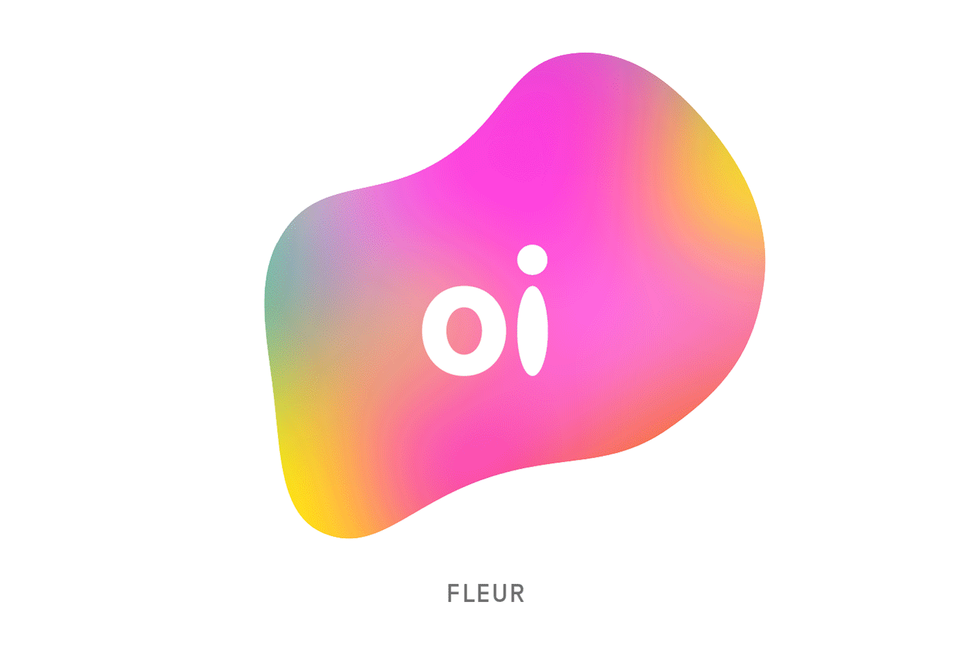
Got an email from the boss praising how brilliant this idea/logo is:
http://www.adweek.com/adfreak/br…
Thoughts?
- https://i.ytimg.com/…********
- Tell boss...it looks like shit!utopian
- Done, done and done again. Would've been 'Brilliant' a decade or more ago, as it is, it's just inspired by a slew of similar concepts.detritus
- what detritus saidmonospaced
- ^ I feel that way too. They are late in the game and trying too hard to appeal to the young millennials.Maaku
- anything that creates more work and options is fine by me.imbecile
- i'd be interested to know if each shape represents an individual for specific reasons or points of input, or even if those individuals drew their own shape.imbecile
- if generic, what's the point, and what is being built on and growing organically other than a pile of random shapes and colors?imbecile
- Yea it's cliché but it's still nice********
- To us cunty designers it's cliché but to the average person it's cool and happy and colourful and different...********
- Those fucking millennials, I blame themyuekit
- I like how the shape changes as different people leave different types of stain shapes in front of their computer engaging in online activities.yurimon
- i dont think the average person is going to react like we will. most likely drool over themselves looking at the pretty colors. we are all different n specialyurimon
- we are a rainbow. so its good in appealing for the audience thus makes it decent design.yurimon
- I think over all this will be redone in a couple of years. its trend piece that will work for the time.yurimon
- Number yurimon, engage.********
- people like amoebas********
- Think about the challenge for just a second: Make a telcomm feel individual and unique. This is a better answer than I think some of you are giving credit for.ben_
- reply with....what's brilliant about it?dbloc
- Carl with a k? Sure thing cark********
- It's a dancing blob.dbloc
- I think it's halfway to personalize the brand's identity for each customer. i would been great in the '90 but today telco is more than just voice communication.********
- I like the concept. A logo that "responds" to those who interact with it.wagshaft
- amoebas are still is the best we can do when it comes to dynamic ci?********
- BTW. Holy shit a design discussion.wagshaft
- it wouldnt work without the names of people. somehow the shapes could be better thought out in my opinion like if you were to take each shape in a transparencyyurimon
- like maybe at 15% opague and combine all available shapes to feel more modular like pieces of whole.yurimon
- i can imagine the use of these shapes along with names in info graphics demonstrating network scenarios. that could be interesting abstract design on featuresyurimon
- the more advance ideas i have for this im going to have to reserve cause its going into pay me territory. but good luck.yurimon
- good luck?monospaced
- oh my dirty mind says this looks like a guy icon looking at a big vagina. like he is thinking how can i tackle this big vagina its so big but i wants it i needyurimon
- s this.yurimon
- what?monospaced
- We're all designers, after all. Like @Wagshaft said, finally a design discussion :)Maaku
- Its not that clever... looks like the aol branding********
- ^ normcore of design?yurimon
- I think its ok. not really taking any risks. its going to be redone in a couple years to a year. watch.yurimon
- repeating yourself?monospaced
- would look better if the morph was smoother imo.dbloc
- after reading the article, I like it even more.imbecile
- Gay Blob?********
- There's a lot more to this than this blob animation. I like it, and as set said we are not the audience, we are just cunty.MrT
- I find it hard to belive when companies say their logo is inspired by this or that etc. It's like drawing a grid over your logo to make it look pro.mekk
- Still like the idea and the overall design!mekk
- Anyone able to sell that kind of visual identity to a company deserves all my respect.sr_rosa
- https://i.ytimg.com/…