ios7
ios7
Out of context: Reply #442
- Started
- Last post
- 546 Responses
- iCanHazQBN0
Are you seriously telling me you find the images on the right to be better looking?
This is probably the worst thing I have ever seen. It's worse than student work:
What the hell is this muddled mess???
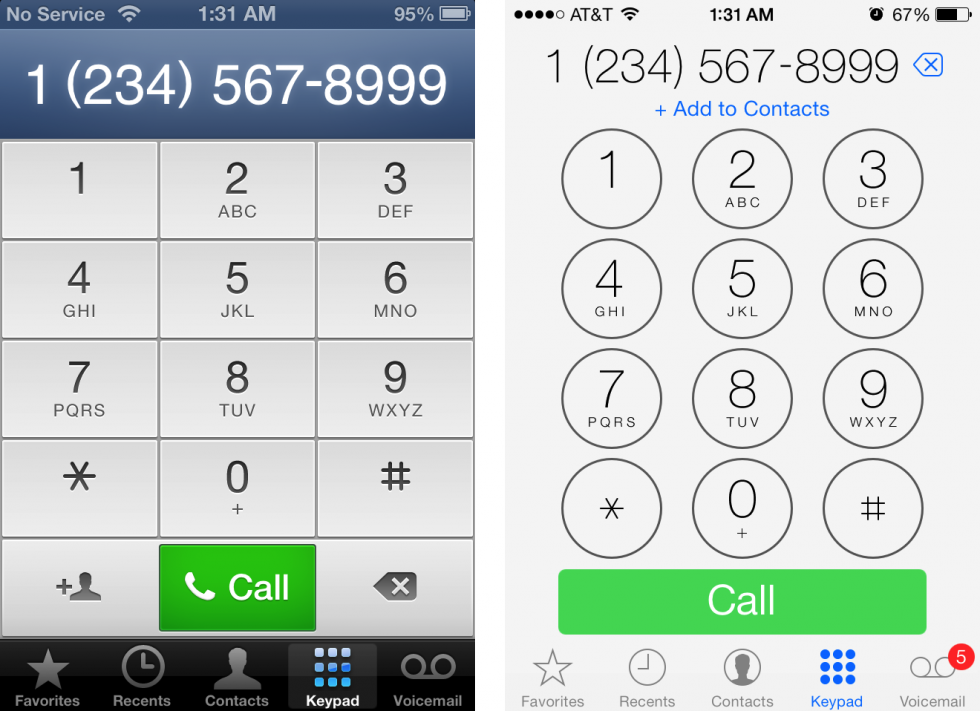
Why does the new Call button need to be that big? Now the "Add Contact" button is squashed under the phone number for no reason. Their decisions no longer make any sense. What's the justification for this? And the sides of the Contact button don't even line up with the number buttons.
- I think they do. They still have problems but they're still better looking than 6ESKEMA
- change is good (even if the phone keypad is so bad it makes me laugh every time i use it)kingsteven
- if i had to make some sort of prediction based on the design, it's that they're making the os independent of screen size.kingsteven
- which could mean bigger iphones, but probably also part of their iOS in the car concept.kingsteven
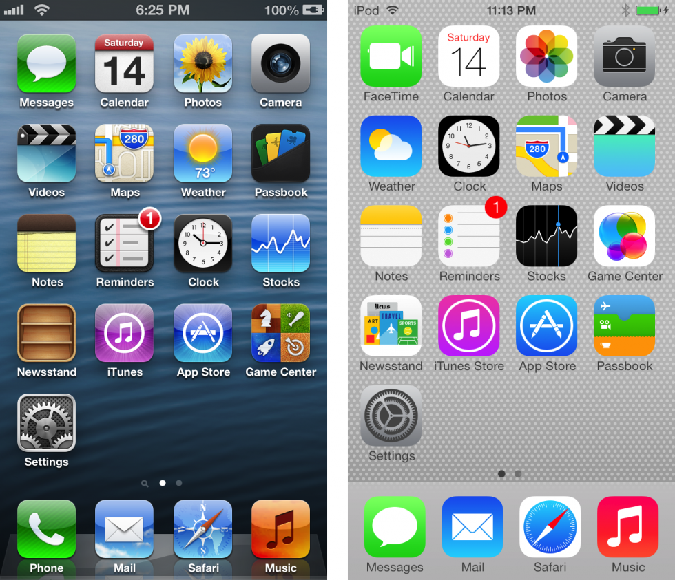
- but yeah, 1 & 2 are an improvement in that noone that cares think < that wallpaper compliments the design.kingsteven
- no.. the new icons are so glaring and saturated that NO background compliments them.iCanHazQBN
- They are not as bright live. Unless you use your brightness settings to the max.ESKEMA
- Goddamn. It's like you just woke from a coma. Timeline on your comment. Page 2monospaced
- well maybe not with that SHIT background, but you do realize the look changes drastically with the user's bg choicedoesnotexist