new waterstones identity
new waterstones identity
Out of context: Reply #16
- Started
- Last post
- 25 Responses
- BaskerviIle0
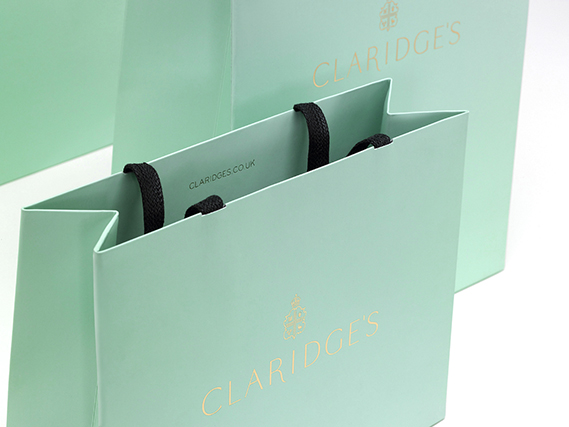
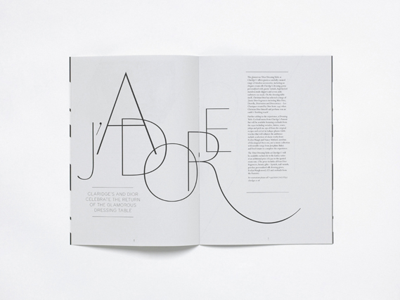
As a contrast, also from CR, look at the lovely work for Claridges rebrand, tradition and contemporary done well:
http://www.creativereview.co.uk/…


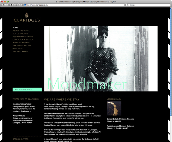

- Lovely stuff, very classy. Website looks like shit though.jamble
- A little too close to Tiffany's blue, no? Looks good on black, though.formed
- Oh, this is very elegant.Continuity