New MS Logo
- Started
- Last post
- 52 Responses
- dearhead0
It is uninspired, but it will function well for such a massive corporation. It's smart.
Xbox has really led the way for good design at microsoft. I hope they continue to value it.
- bumdrizzle0
Works well.
Interesting to see better design work coming out of Microsoft now than Apple.
- it's JUST a logomonospaced
- no, mono - its coming with their new ui called "metro" used in all their upcoming productsmekk
- Let's see how far they can push the squarenedux
- vaxorcist0
gotta love...

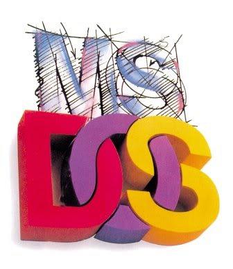
and this sums up the half-finished twisted mess of DOS...
- prophetone0
i like it
- k_temp0
http://seattletimes.nwsource.com…
According to the poll (in the right) people like this logo the most.
- 20020
good design system
- CyBrainX0
I'd like to see the other program icons. It's a nice start. I wouldn't be as impressed if I hadn't known how clunky, bloated and inconsistent Microsoft is about everything else they make and how they represent themselves.
- marychain0
very uninspired. I don't think there is anything here
- What the logo? or microsoft?TheBlueOne
- specifically the logomarychain
- WeLoveNoise0
i quite like it
i think there's a lot more to come from MS from a design perspective