New MS Logo
- Started
- Last post
- 52 Responses
- WeLoveNoise0
i quite like it
i think there's a lot more to come from MS from a design perspective
- marychain0
very uninspired. I don't think there is anything here
- What the logo? or microsoft?TheBlueOne
- specifically the logomarychain
- CyBrainX0
I'd like to see the other program icons. It's a nice start. I wouldn't be as impressed if I hadn't known how clunky, bloated and inconsistent Microsoft is about everything else they make and how they represent themselves.
- 20020
good design system
- k_temp0
http://seattletimes.nwsource.com…
According to the poll (in the right) people like this logo the most.
- prophetone0
i like it
- vaxorcist0
gotta love...

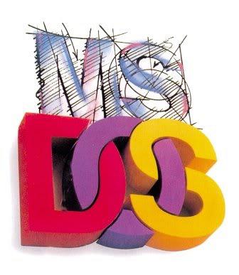
and this sums up the half-finished twisted mess of DOS...
- bumdrizzle0
Works well.
Interesting to see better design work coming out of Microsoft now than Apple.
- it's JUST a logomonospaced
- no, mono - its coming with their new ui called "metro" used in all their upcoming productsmekk
- Let's see how far they can push the squarenedux
- dearhead0
It is uninspired, but it will function well for such a massive corporation. It's smart.
Xbox has really led the way for good design at microsoft. I hope they continue to value it.
- fadein110
nice to see them taking design seriously at last...
- animatedgif0

- lolmonospaced
- hahahaernexbcn
- ahahahaaCanHasQBN
- yupmoldero
- You guys do know that microsoft boxed their colors way before this one, right?Peter
- Ooooh shit!pig
- @Peter, yeah I was just posting it as a joke.animatedgif
- Llyod0
it looks weak
- qoob0
It's OK, but doesn't really change their image at all. More of a fresh coat of paint to keep them looking modern.
- mikotondria30
What an impossible brief to have to redesign/update to..
Considering the impetus and inertia of all those years of products and 2nd rate identity and revisions and reworks, and the lack of consensual forward-thinking that this is now compared to 15 years ago. Back then it was ALL future, all esoteric, the connected world and spaces we live in now were monumental structures just on the horizon, we were at a sweet spot intersection of fantasy and reality. Now we're there, the new generation of users have never not known a Microsoft so embedded into the experience of living online that it's almost been invisible. To revisualize the brand and paradoxically straddle the world of the old future and the new social world perspectives is almost unaskable. All they can do is paint, there's nowhere conceptually for them, or much of the web and tech's visual lexicon overall, to go. We even beat Moore's law, our tech and web experiences spilled over into mobile and watered that garden a little, but we're going to be treading water for a good few years with only minor improvements in bandwidths, resolutions, novel social distractions until something like quantum computing comes along to deliver processing and networking that'll be orders of magnitude better than what we've been used to the last 10 years.- lighten up FrancisLlyod
- Yeh, should do.mikotondria3
- Jethuth Chrith, Franthith!pig
- I think the first sentence is a valid point.
They rest of it....oy vey...mikotondria3
- ernexbcn0
I don't like it. Seems bland.
- ernexbcn0
- OH SHIT!animatedgif
- soundtrack on this is pretty awesomeinstrmntl
- wha? dining room suites on sale at kern hill?!prophetone
- The have been waiting for a while to bring that logo then lolnumero1