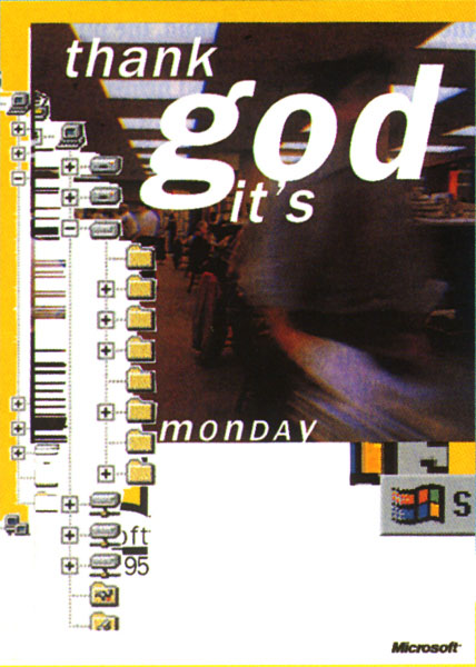
New MS Logo
- Started
- Last post
- 52 Responses
- MrNibs0
They dropped the ® ? why?
- monNom0
^ not registered yet?
- dijitaq0
wish they would ditch the perspective for the windows logo and just use the outline from the ms logo.
- SrSamaurai0
wonderful looking squares. microsoft is very creative and innovative.
Microsoft is the autotune of the computer industry.
- tOki0
Personally I like it, I think that due to the nature of their business that huge change simply isn't going to happen, even if windows 8 seems to be marking a turning point for them as a brand. I guess for me personally I see microsoft as somewhat of a staple - generally consistent and expected, and for their main customers (business) this familiarity is really key to their continued success. So hate all you want because t without them the world of technology would be much worse off.
Corporate branding in particular is one of those things that is held very close to heart, and often big large leaps are dangerous leaps of faith that big corporates are not willing to take. There is HUGE equity in those 4 simple squares that people are so quick to dimiss - something you don't ignore if you're maintaining global brand recognition. There are literally entire generations who have grown up seeing those colours and shapes loading up on their computers. As far as the type goes, it's simple and clean, again nothing unexpected - but that's not a bad thing.
I like how they've had some fun with it all in the video, albiet the rainbow of brand colours mish mashing is somewhat of an overused and abused trend at the moment - yet for a company who is so large and diverse, it's an acceptable choice.
I suspect that the master brand will always stay relatively low key - and the product families will have more room to be creative so that they can appeal to their respective niches more effectively, the main thing is that hopefully the brand guidelines that come out of this exercise will be structured enough to create consistency but leave enough room for a bit of magic.
- Your final paragraph is right, and a great goal to aim for. Do MS have a history of doing this effectively..? we'll see. Hope so.mikotondria3
- pig0
The logo is totally inert.
There's not much to love, or much to hate, it's just there. It's magnolia paint. It's mayonnaise. It's fine.
- pig0
- pig0
But – gotta agree the overall Windows UI has a promising future.
Clean, typographically-led blocks, good use of Segoe (which I actually like).
Feels like it still needs a little something...but makes Apple's grads/drop shadows/rounded cuteness feel dated and lame all of a sudden. There's some seriously good DNA here, hope it comes to something...

- qTime0
So when are Apple going to loose all the gradients from their branding?
Its starting to look very dated.
- animatedgif0
Think it's gone a bit too far, a happy medium between the new MS branding and Apples would be ideal
- faxion0
Remember when they turned to David Carson in an attempt to appeal to the yoot

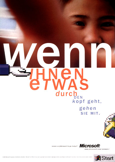
- what the FUCK is that 2nd one. If I saw that land on my desk, I'll drill their eyes out, what a fucking terrible pos. Jesus.mikotondria3
- vvvv0
If this is good and hip and hop. Explain what was wrong wit this one!?:

Companys this size can do what ever they want and as simple as they want without any meaning(design wise). Imagine Microsoft being a new startup comapany and we all could agree that this new logo is utter shit!
Cheers!- The logo is not the point. The logo is not the point. The logo is not the point. The logo is not the point. The logo is not the point.pig
- Say that to your client! I think it has a huge point!vvvv
- ..or are you are saying the "new" GAP logo was a good concept after all!?vvvv
- It more about context, company history and brand inertia/momentum. Music is the gap between the notes, etc..mikotondria3
- Yeah, my mom was just saying that as well!vvvv
- my point is, after all 99,99% of the consumers dot give a flying fuck our designers opinions about context, company history and brand inertia/momentum...vvvv
- ...company history and brand inertia/momentum...vvvv
- btw, I respect your opinion as well. But that logo being icon for such amazing company is just poor design and lack of imagination! ..oh snap, now I understand!! That what Microsoft wants to be. Cool as Xerox!.. :)vvvv
- ... imagination!vvvv
- 1) The Gap logo is not the MS logo, it has no redeeming qualities, whereas the MS one (arguably) does...pig
- 2) Designers crit logos like they're the locus of everything. Not so. Consumers value UI, overall execution & feelpig
- have to disagree...
but thanks for your opinion!
vvvv - And cheers again! ;)
..for friday beers!vvvv