Logo Feedback
- Started
- Last post
- 50 Responses
- genfour0
take off all the drop shadows, letterpress effect, inner glow, web 2.0 etc when you make a logo. it shouldn't depend on any of those effects.
- Again, logo is not for print.pauliusuza
- It's still great advice.NONEIS
- i agree with "not for print arguement"... old rules of logo design are not always relevant these dayshorton
- lukus_W20
Where will the logo need to be used? What makes the company unique? Who will be using the service? What was your brief?
- I wrote it already: this is for a web app related to travel planning, online online, maybe iphone / android app toopauliusuza
- attentionspan0
it needs to have more wow effect add some gradients to the map.
I also think 1 is good but i think you should add a compass, binoculars and maybe a backpack? just so peeps ged it
- pauliusuza0
LOGO WILL BE USED ONLY ONLINE - NO PRINT
- idea for the map was to add more depth to the logo, make it pop out from it's suroundingspauliusuza
- a logo should hold up without effects, regardless of context DAWGsilentpost
- i_monk0
The new font is nervous and leaning all over the place.
- I'm out of interesting fonts here, can you propose anything?pauliusuza
- mrghost0
^
pauliusuza
"LOGO WILL BE USED ONLY ONLINE - NO PRINT"theres your problem...
- 74LEO0
Well you could make it upside down. - over done for you aussies anyway.
do the push pin going into the map of australia . make australia a solid color. most peeps know what it looks like.
- I HATE when people misspell a word Xspecially in a logo. Oops I thought it was australia haah haah austria74LEO
- moldero0
go here: http://www.qbn.com/topics/573371…
here maybe: http://www.google.com.mx/images?…notice the simplicity. the difference between a logo and a shitty graphic is logos are meant to be easily identified and remembered by just a glance. too much detail and your logo becomes just a shitty graphic. get out of photoshop, get into illustrator, get out a paper and a pen start jotting down ideas. ex: you got a map, drop the map but pull things from it to use as your logo, maps have a lot of elements, legends, compases n shit, modify a font so the first character slightly matches one of these elements maybe. come up with 10 or 20 of these then take it from there
- attentionspan0

- nice keming74LEO
- better alreadydoesnotexist
- WINNER!utopian
- WINNING!dbloc
- no. if they make it past the miss spelling. that comma is sure to mess them up. Also no personality.monNom
- 74LEO0
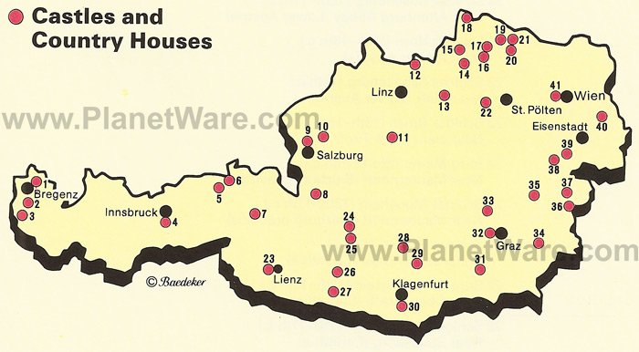
Sorry think of this every time someone says they are from Austria.
- 74LEO0
TRAVL to Austria!!!

- odds0
looks shit


- exact.doesnotexist
- app icon != logopauliusuza
- a logo doesn't have to work as an app icon...thiten
- odds0
this you too?
http://www.travl.at/
looks shit as well
- dMullins0
I think the first one was better. Personally, I would recommend reverting to the first one and doing the following:
- make the map a bit smaller so it doesn't compete with the logotype for proper hierarchy (you'd rather have people read the company/site name than looking at the map)
- reduce the colors in the map graphic
- lose the bevel on the type
- lose the gradient on the type
- utopian0
bump