ArtDirectorsClub
- Started
- Last post
- 36 Responses
- mydo
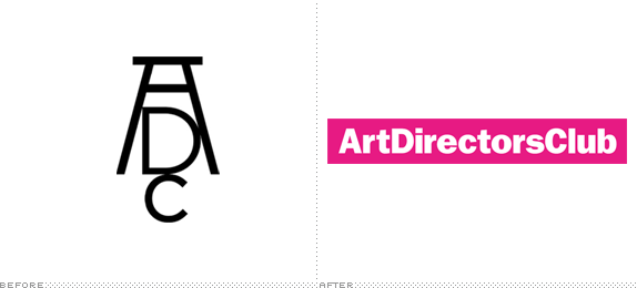
force12 just posted a link in another thread. and in it i found this. seriously. WTF. a group of critically acclaimed designers that hand out prizes internationally to young talented creatives. They get a new logo by paying another company to write their name in a box in what is just about a system font these days. i don't understand.
- mydo0
rant over
- typist0
system font? which system have this font?
- forcetwelve0
i agree, a real shame. i love that old logo.
- duckofrubber0
Holy shit, looking through the PDF and there is no consistency to the logotype used throughout. Just look at the lowercase 'r'. Awesome.
- Etype0
their "MANTRA" is kerned poorly as well
- evanburke0
eck...
<img src="http://www.evanburke.com/drips.jpg">
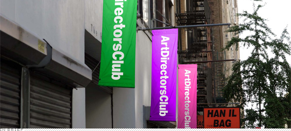
Why did they even redo their logo in the first place?
- evanburke0
:(

- student work?baseline_shift
- paint effect heh ?elektro
- the 1st is okay. the others are not.akrokdesign
- forcetwelve0
is it approved or just concept?
- forcetwelve0
wow - i just read the comments on brand new. interesting. the new logo is getting SLAMMED. and for good reason i reckon.
- but there are also people who love it, i dont know why.Josev
- neue75_bold0
doesn't bother me..
- to me it's not so much that the new logo is bad, but it's the fact that they dropped that lovely logomark.forcetwelve
- In what sense was the previous mark lovely? It was just copying Durer and didn't really work as a logo.ukit
- Etype0

- the r!Etype
- lol.the junior designers club?baseline_shift
- I don't followEtype
- neue75_bold0
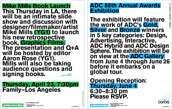
I like the applications a lot [most of them] I suppose to me, it's much less obtrusive and generic, which at the end of the day, is much easier to use in situation. The old mark, as lovely as it was, felt dated and stuck out like a sore thumb... This "brand" as such, should allow the content of the events to really come to the forefront and possibly allow a diversity of images/styles to sit behind the branding without competition...
- rkrd0
German ADC:
Well at least they got rid of the awkward Durer reference. And it's not only the logo that is new.. And identity "systems" are in nowadays... I don't get the type choices, not one of them. Especially Benton for young guns and Akzidenz for the rest? And that "r" thing...
I like how Trollbäck+Company (not a great logo either btw) is pixeled because someone place a jpeg instead of an eps in the end.
- neue75_bold0
AIGA logo is just type in a box but it allows for so much to be done around it which is what this type of brand should be about... They are a vehicle, a conduit, this brand shouldn't be about the organisation itself...

- Kiggen0
neue is right. I'm not a big fan of the logo but a logo is a part of the puzzle in branding. Try looking at the overall picture.