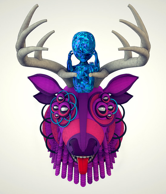
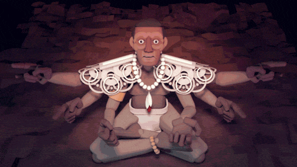
Show some recent work
- Started
- Last post
- 8,594 Responses
- MSTRPLN0
Personal initiative for branding a creative collective in the city of Ottawa.


- sweet. i dig your work, mstrpln.akrok
- nice. It looks like you need to work on the golden ratio stuff a little more. Are the circles lining up exactly?VikingKingEleven
- SWEEET!OSFA
- also, did you consider swapping the leaf and the "c"?zenmasterfoo
- Lovely!Stian
- love itkingsteven
- Naice.i_monk
- v nice!whereRI
- Thanks for the feedback.MSTRPLN
- looks acedopepope
- very very nice, sir.
(/maam ?)mikotondria3 - I Like®utopian
- Sir.MSTRPLN
- Solid! Good to know we have some local talent! To bad we're on the other side of the river!non
- seeing this again, I would like to upgrade my comment to 'Fucking Great !'mikotondria3
- gorgeous! love the colors!
but as viking pointed out, why is the c off centered?Hombre_Lobo - very awesome. although I keep thinking its a winter olympic event.inhaler97
- antigirl0

from the weekend
- theredmasque0
a few paintings / drawings from the past few months


- OSFA0
Initial lettering sketches for upcoming project :)

Pardon the crappy quality.
- i dig it!!bigbaby53
- Nice.
Needs a neon version too
:)detritus - second that neon suggestion :)WeLoveNoise
- +1tank02
- theredmasque0
Been on a sea turtle kick lately

"The Garden of Honu"
25 x 19 inches, mixed media on paper
"The Flight of Honu"
10 x 8 inches, liquid gold leaf and acrylic on canvas- Nice... Just saw one out surfing this afternoon for a bitbzsaw
- awesome!!! I am jealous. i only get to see them in aquariumstheredmasque
- baseline_shift4
My music video finally launched, so I made a separate thread about it. Let me know what you think!
http://www.qbn.com/topics/698918…
- Ash_B0

This is a still from a set of banner ads I created this week for a new show on ITV1. I did all design, art direction, animation and typography.
You can see them by following the links in the top post from my blog: blog.ashleybrowning.com
- where_am_i5
decided to put the process film up on vimeo, you can view the finished shorts on the other links
- boobs-1
One of my recent collages:
- tank020
Logo for an music organisation.


(Yes, I recyled some of my own personal work for the bag, images will change ofcourse).
- i like it.skt
- i love it.airey
- have you tried tweaking the p's and a's so they look more illustrated?Amicus
- you mean recycled some of Dieter Rams work =)erikjonsson
- Nicedigdre
- at first I saw Fappant, lolarthur
- same. I saw Fappant.Jaline
- HAHA...its a flemish dialect word,
maybe they are all fappers though ;)tank02 - Awesomeukit
- Rad! I agree with amicus, maybe modify 1 "a" & 1 "p" to give it a more hand lettered feeljiaf
- Love that bag.JerseyRaindog
- DaveO0
Identity for a salon in London....


- <likemikotondria3
- Lovely.egosmoke
- sexy!OSFA
- effin nice!tank
- fancyakrok
- Foil on textured is one of my favorite contrast.non
- Lush.JerseyRaindog
- flyingnowhere0
Still a work in progress, but its looking nice.
http://www.jerky.com/
Been using miva. It's a pain!
- de4k0
- instrmntl0
Portfolio test to see how my work would look with shapes dependent upon role. I also made it so u can have work preview at square, circle, triangle, random, or role, through xml. This was the role test.

- reminds me a bit of:
http://www.myorangeb…bigtrick - but just a bit.bigtrick
- reminds me a bit of: