Show some recent work
- Started
- Last post
- 8,602 Responses
- Spookytim0
This is a VERY bad visual, its a quick cross processing test of a very early file so its very dark and contains roughed out details that have since been vastly improved. Its the only version I can find worth posting up though right now. This is what I'm working on ... I'm building a big crazy mansion room by room. Each room will be filled with crazy machinery torturing fashion models which we shoot in May. I'm creating torture machinery right now.

- man, you have some weird tastes in pornkelpie
- looks pretty rad.canuck
- thi is the fashion contract? are you sure the beanpaste on the genitals wouldn't fit? looks good my friend7point34
- Cripes, SS, nice work. Mind if I ask *roughly* how long it'd take you to put something like that together?detritus
- D, took me 5 days (-QBN) to build the room from my original sketch. This shot is day 3. Its different now.Spookytim
- that looks great. good job bitchLlyod
- Thamks Man.Spookyhome
- digdre0

- i wnt comments.digdre
- What's it for?Spookytim
- I like the Freitag bag. ;)JerseyRaindog
- Stupid me, its for your fridge.Spookytim
- What is it? Whats it for? Looks a bit studenty...phatlee
- it's for me, just some illustrator thing
yes, I like the bag toodigdre - i like it it looks like you had fun making it.capn_ron
- isn't that the reason why we all do it, because we have fun while doin it? :)digdre
- money shot?harlequino
- digdre0

- comments plz.
I'm woring on the 'vitafit' font so it fits more to the icondigdre - I like the logomark, but the type doesn't seem right to me. it seems tacked on. have you tried skewing it?ldww
- I'm working on that, expect an update asapdigdre
- It seems nit picky but I wish the top left of the V didn't taper (or seem to) so muchvoiceof
- comments plz.
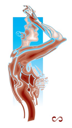
- Cultr0
Re-working an old illustration
- kult0

- (Unfinished though)kult
- Cool work.
Horrid produkt.detritus - Haha.. no comment!kult
- hmmdigdre
- Overdone the shadow or too smoothly on the big white bit imho.Spookyhome
- nice!Meeklo
- I must say Kult, you are shit hot at your visual work. Do you use allot of 3D, or is most done in Photoshoproundabout
- mild0
you could try this if anybody wants to see
- kult0

- digdre0

- not sure about the A-F connectiondigdre
- comments plzdigdre
- You've panicked and are over-designing.designisdead
- omg! designisdead.
tips?digdre - I thought the VF was working better in your above sample. You just need to refine the way it's drawn.Josev
- I didn't like your type selection and relationship to the mark. That needed some work.Josev
- genesmirnov0

- Love colors.. but I think killing the grunge would make it even betterkult
- right ongenesmirnov
- When I was putting it together, I was thinking it needed a binding element
genesmirnov - add an arch to the bottomLlyod
- the dude on the far right looks like he's about to sodomize some(one/thing)Rodimus79
- arterie1
illustrations and ideas for a wine label pitch.

- muckle braw! is that all digital?GreedoLives
- hand drawn and extreme photo manipulation.arterie
- wow, those are sweet!OSFA
- thanks :)arterie
- kezza_20
I came up with a viral concept for Scottish Widows that became some banners, and from the footage we shot for the banner campaign I re-editted it into a TV Ad:
50 sec here:
- Ramanisky20
my weak-ass AfterEffects
- the motion is very good. the boards suck ballsLlyod
- that was problem .. no boards were used .. everything had to be done in 3 days on the flyRamanisky2
- that's pretty good for three daysLlyod
- tank020
shooting & editing some interviews for the momu fashion museum
here...
rough version of the first interview...
- digdre0
show some more, people
- tank020
another half finished interview?
- Spookytim0
Hey arterie, your work is bloody ace.
- digdre0

- WIPdigdre
- Yeah, tidy, like it. Looks useable and cool.Spookyhome
- thanks, just need someone to code it (:digdre
- dzialifornia0
hola! pictogram power!

