Quick Logo Poll
- Started
- Last post
- 32 Responses
- Hayzilla
Morning guys,
Simple one here. I'm at logger heads with the client in the final iteration of their new logo. It's a bit boring I know, but just need to know if you prefer A, B, C or D? They are in agriculture if that helps.

- renderedred4
D
- set6
B is too reminiscent of the old Gap logo. I like D, it's big and blocky and has impact, but I really think it needs more space to breathe. Sorry to be that knob head that plays with your work but this feels a bit comfier to me...

- and set the backing square at 45°detritus
- yep - this.fadein11
- much betterscruffics
- Cheers appreciated.Hayzilla
- What he says but I'd say too much gap here and not enough in that one.
I do think the P is a little Dull though..mugwart - How dare youset
- Good feedback, these details really matter. Also my prefferd choice. It will be interesting to see it in situ.Chimp
- No no no no no. If you are one letter away from gap dont use a square. Triangle it up...matching the a.********
- Oh god why am i getting suckered into doing someones work********
- shut upset
- lol setdetritus
- Haha********
- detritus0
D for me too, although if it were me I'd check a variant of B that has D's shape.
- B as-is is just a bit flimsy - probably ok for a completely different context, but it's not solid and earthydetritus
- and make it yellow and green.detritus
- noooo
https://upload.wikim…set - haha, shieet, i wasn't even thinking about good ol' travis perkins angry botty wipedetritus
- angry botty wipe?hans_glib
- never mind, i'm just being infantile -
'TP for my bumhole'. yeah, no.
Nothing to do with the builder's merchantdetritus - lolset
- ********0
D
- and have, like, 12 dildoes sticking out of it, like some sort of angry crustaceandetritus
- aagaha :D it would be great to animate ahja********
- dee-dubs0
D
- Bennn0
D
- Bennn0
D is most iconic and readable
- fyoucher12
B. but lose the black square and invert colors because, like what Set said, my first thought was the old Gap logo.
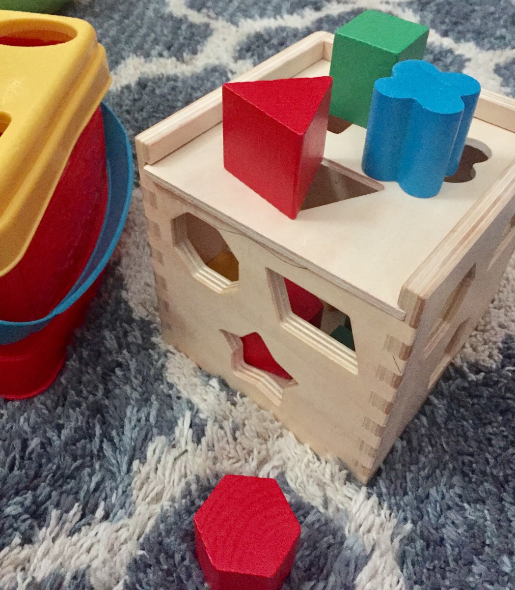
The others looks like a kid's peg / block game for special children.
- Hayzilla5
Cheers guys.
I have to finalise now and send the first press ad off this afternoon. So gonna swallow my instinct and go with D. Thanks for confirming my clients desires. You cunts. LOL. x
- CygnusZero4-4
Can we know what TAP is to be able to give better direction?
- section_0140
B, but with A's font.
- nbq0
D but try strokes instead
- Gnash3
Set's D
- monospaced0
Late to the game ... maybe consider adding weight to the cross bar in the T, to really lock in the geometry and relationship between all the characters.
- umbee540
D - solid. color will be your unique element here.
- dbloc0
D is the most solid
- _niko0
D. throw that shit on some agricultural looking mockups for the final decision.

