best subtle logo redesigns
best subtle logo redesigns
- Started
- Last post
- 19 Responses
- indian_pole
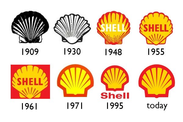
looking for some good example of logos that have been refined, retaining elements of the previous logo but made better.
thanks.
- SimonFFM0
too obvious maybe, but: Apple?
- formed2
- ah yes, from hp to bp...
;-SAVAVA - 1941? didnt they combine in the 90s?********
- dang, that's nicescarabin
- liji********
- Louis CKrobotron3k
- lipKrassy
- ah yes, from hp to bp...
- formed0
not so great one, but ok:

- check mark is stupiddbloc
- agreed, from the very beginningscarabin
- the most recent reminds me of the Gap redesign. Just put it in the top right corner.dbloc
- hate this logo, everything about it.utopian
- shit logomoldero
- hey, now, it's Pentagram!formed
- Pentagram, but I bet the client pretty much designed it.dbloc
- bklyndroobeki0


- Besides the use of the star...how is this a subtle transition?utopian
- The type utopianbklyndroobeki
- dbloc-3

- ********-2

- _me_1