Pantone match
- Started
- Last post
- 8 Responses
- ADP
Hey qbn,
I've always been a digital designer, never had to deal with print and pantones before. I need pantone colours that resemble as close as possible the two colours below... would anyone be able to help me out please?
Would be much appreciated!
Adam

- face_melter0
Picked this up a while ago, helps as a quick-check guide.
- mekk0
Y'all need some color management course. Use the Pantone Matchmaking system face_melter posted. A color picked in RGB using the pipette and then converted to fit an unknown CMYK profile will not look nearly as the color desired.
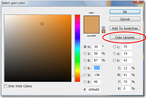
- How is that any better/different than using the Color Libraries built directly in to Photoshop?detritus
- VectorMasked0
You can try with illustrator.
Select object with colour -> Edit -> Edit colors -> Recolor Artwork -> at the bottom below the word "none" click on icon and select "colour books" -> and select the kind of PMS book you need.
After that your object should have the closest PMS match to your original random colour. Not perfect but it can help.
- see_thru0
http://stocksigns.ca/pantonecmyk…
I googled 'closest pantone colour to CMYK 12 41 70 0'
- SoulFly2
You really need a Pantone book. It's the whole purpose of Pantone colors.
You will never know if the color you select is "dirty" or too dark or too light unless you look directly at the book. A lot of the Pantone colors can be very cheesy, surprisingly different than what you expected, once someone prints it.
I think those books are expensive, if you don't have one you may want to ask a friend to let you borrow one. Most print designers have it. With the book, just browse through them until you find the color close to what you see on your screen. The "rough conversion" through the techniques above will most likely suck, so then choose the next best option. Something bright and clean.