New AT&T Logo
- Started
- Last post
- 20 Responses
- dbloc0
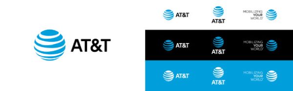
reversed out and switched to all CAPS.
- dbloc-2
American Telephone & Telegraph
- utopian-2
quarter of a million dollars to reverse engineer the logo.
- set0
Preferred the type before but the mark is nice
- pango0
Reversed?
- utopian2
Fuck You...Pay Me!

- dbloc2
another $500K please

- bainbridge-1
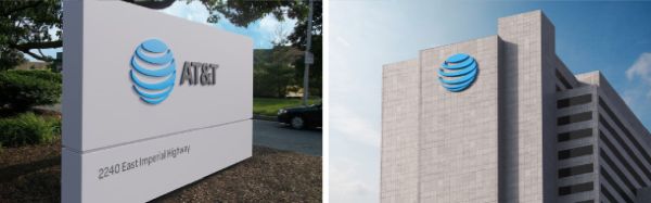
Why bother? It costs so much money if they're going to replace signage.
- microkorg-1
Invert the symbol and uppercase the text.
Charge for X tens or hundreds of thousands of dollars.Nice work if you can get it.
- bklyndroobeki-1
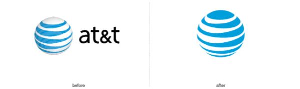
How could you go from this

to that?
- Talent is a mystery, my friend.Maaku
- sarcasm?bklyndroobeki
- duckseason-1
Some more subtle changes to the mark.
There also used to be two different versions based on light/dark BG colors.
- subuniverses-2
i would do this
A T T like telephone lines

- yeah ... about thatfuturemongolian
- telephone lines are practically obsolete. At least in the futuristic ideals they are trying to present.dopepope
- no offense, but the A is a huge waste of an extra pole that's unnecessary.kona
- not a fan of the grass shoesdbloc
- im talking about the letters being displayed in that style. A T T as if telephone lines+polessubuniverses
- subuniverses-2
whats does AT&T do?
- the manufacture all-terrain armored transport.futuremongolian
- subuniverses-1
they should have dropped & ATT
- the & is the best part, in my opinionmonospaced
- ^agreeddbloc
- subuniverses-1
A T & T might sounds cool when you say it
but showing it it like AT&T
sounds like AT and T
plus the dot com is att.com
- yurimon-1

- yurimon-3

- boobs1
It seems to be drawn really shitty.
But maybe that is to signify their customer service and quality of product?